Mike Nelson: Thank you again for coming to Unspam. I love you all so much. We talked about us being 10 years old and a hundred thousand. We reviewed a lot of emails. You’re like, why do you do this to yourself? Why would you go through all these submissions and look through all of them? To give you a little background, when Matthew Smith launched the domain, it was really about brand being a big part of what we all experience every day, and our inbox is almost the best place to get that brand into somebody’s daily life. Yet it is one of the last things that our CEO or CFO thinks about. I know this world. I started off in email in 2009. Don’t do the math.
It was really hard to get a program up and running and have people focus on email when they were focused on SEO or SEM or social media. Time and time again, I was able to come back and say: look, we are in their inbox every day. We are not competing with the Facebook feed algorithm or the Google ranking feed. They give us their information and they want to hear from us, often more than through any other medium.
Somebody will touch your brand through the inbox. But generally, like I said earlier, we had some eyeball-cringe kind of emails back in 2009 to 2014 when I was really gung-ho in collecting emails. It just made me sad. So first off, what is brand? If you want to talk endlessly about brand, Matthew Smith will talk to you for hours. I get a lot of notes. I’ve worked with him for the last 10 years and developed what that is.
Brand is often seen, it is heard, and sometimes it makes you feel something, but it is not a logo. If you are with a brand and a new CMO says, what people need is a new logo, you ask why. What is that going to do? Did you see what Uber did? They went to a weird square thing and then they went back. A logo is not going to change how people feel about your brand. It could if you had a really bad logo, but it is just part of a brand. Let's take IKEA for example. Maybe you know this brand. Have you ever been to an IKEA store or purchased from IKEA?
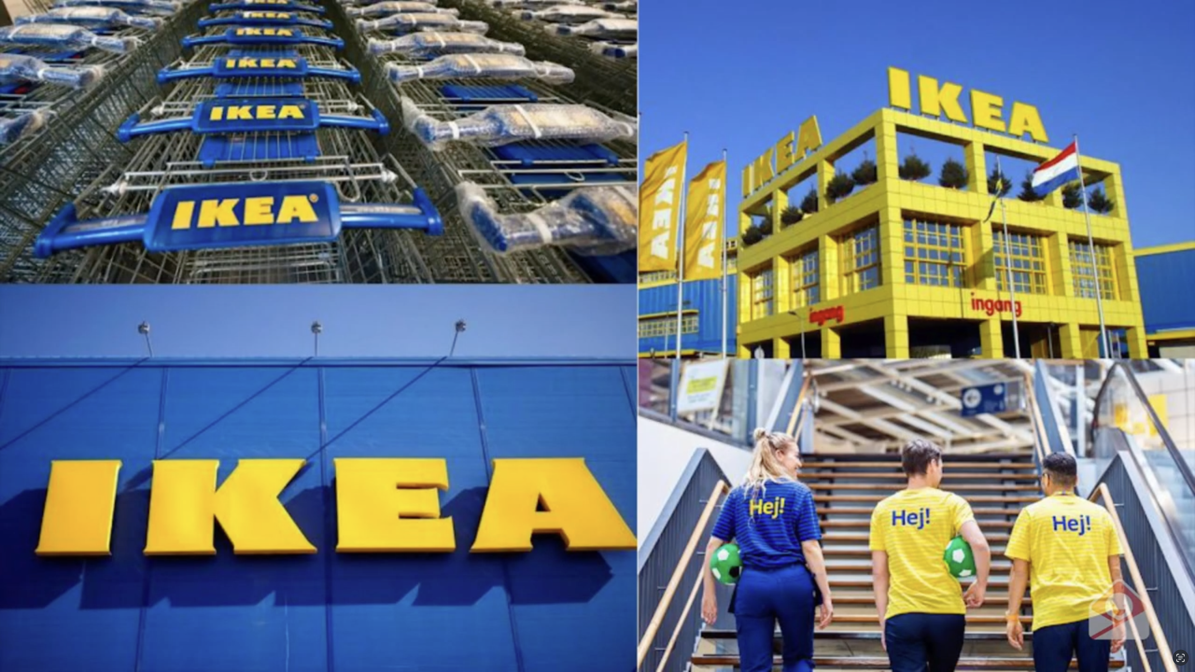
They have blues, they have yellows, that's about it, and they have text. But when you go to their store, you really get attacked by their blue and yellow. Their team even wears cool t-shirts. Their catalog, if you've seen it, has this manicured set. You've walked through their showroom and you just know when you see it, that's probably IKEA.
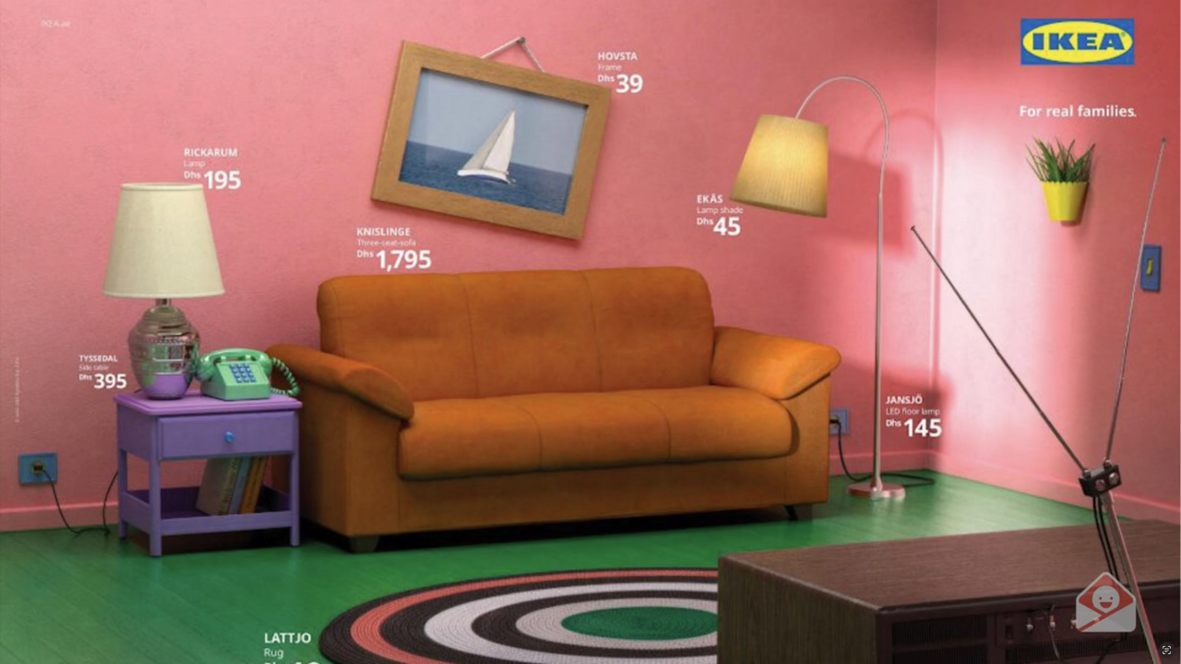
And when they do things like this, even though this is the iconic Simpsons intro, they have those names next to the prices and you're like, oh wait, that's IKEA. The brand is still extended, even though you have the logo up there. But even if you took the logo out in the top right, you might still think that's IKEA because they've done it so well for so long. And again, through their emails, their experiences every day. This feels a little less like their brand than anything else. Who here has thought, I’ve got to build something, this will be the best five minutes of my life, then no, the best 30 minutes, and then the best 55 hours of my life. Actually this is like Schrödinger's cat. If you don’t know, this is why this guy is confused. He’s like, I figured it out, if you put a cat and toxin into a box, I figured out what Schrödinger’s cat means. If you know what it is, it’s a quantum physics thing and you should go look it up. It’s kind of sad, so that’s awkward and I’m sorry. But all these expressions are brand and they’re made and designed by an individual.
Again, what is design? If you see it, most likely somebody crafted it. A person made it, designed it for you. This is anything you hold. These are the chairs you’re looking at. This is the thing I’m holding in my hand, a clicker. I don’t even know the real term for it, but someone designed it. You’d say, isn’t design subjective? I could like a design, you could hate it. Here’s a little example, because I’m talking about design trends and we need a base level of what design means.
Imagine a car in your brain. It could be your car, your dream car. You might think of a German brand, maybe a Volvo, maybe a classic car. Generally, what you’re thinking of is a body with wheels that takes you somewhere. That’s the concept. So is design subjective? It could be any of those. But did any of you think of this? 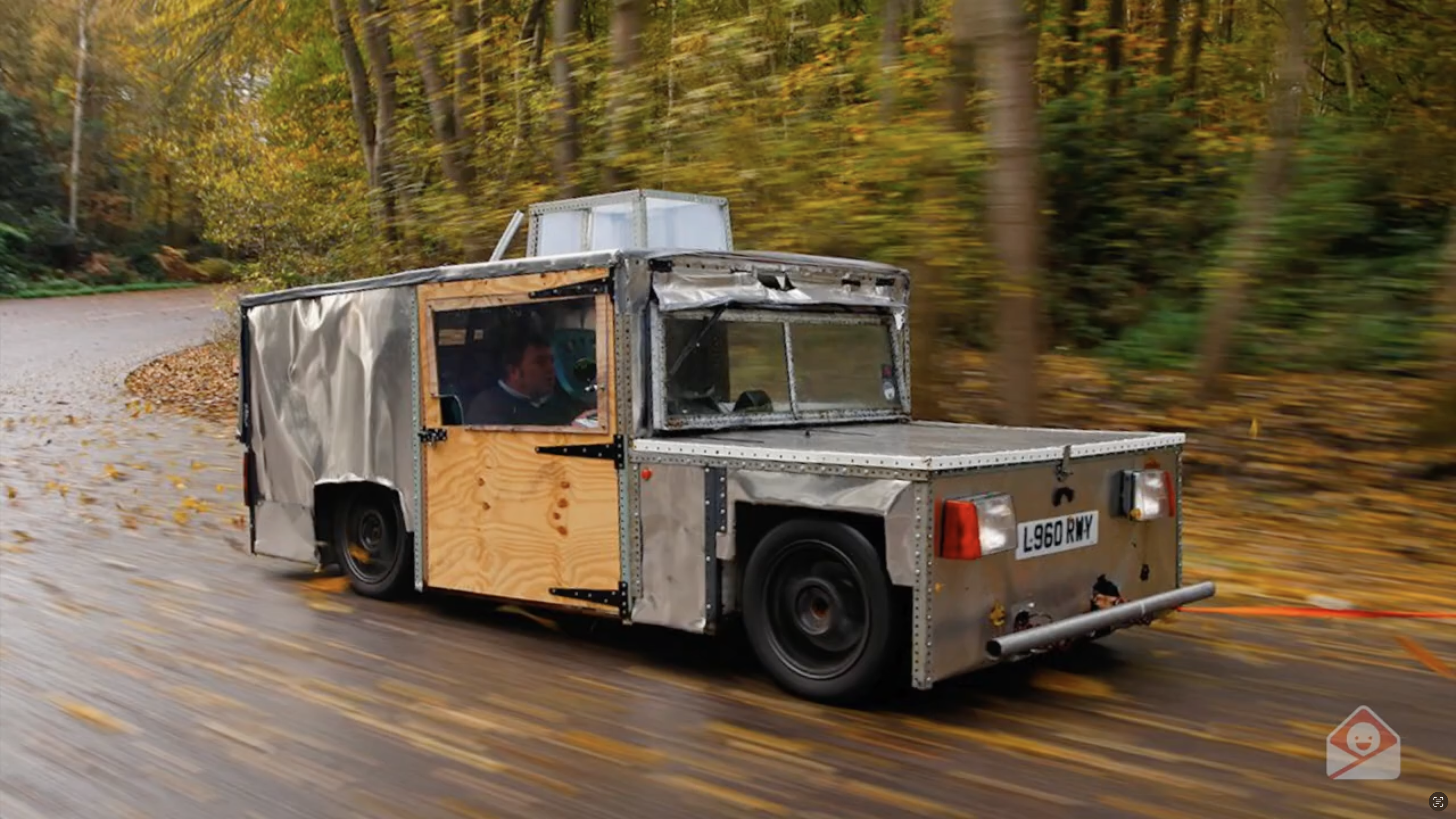
Someone designed this odd vehicle, but is this what you thought of when you thought about a car? No. Or this tiny thing with a sad-looking guy? Or this vehicle with no wheels? It has a body, yes, but not the body of a car. Still, somebody designed it. So design is the craft of communicating something visual. It’s a visual language. We use language every day, and design is its visual counterpart. What’s visual language? It’s an interpretation of what you see into meaning. So lines, shapes, colors, proportions, scales all become visual language. Designers know why spacing and structure need to be certain ways. I am not a designer, you probably figured that out, but I’ve spent 10 years looking at emails and trying to understand what makes a good one. What similarities exist in white space, font choices, what they try to portray when sending into your inbox?
Look at faces: same face, different expressions. Each expression makes you feel something: sad, happy, confused, disgusted. Typography does the same. A playful, whimsical font feels jovial. A bold, thick one feels powerful, in your face. A technical one feels precise, intriguing. A serifed elegant one feels classic. Graphics and illustrations too: they can make something friendly and nostalgic, or creepy, fearful, brazen. Colors as well: red with bold type feels like horror, while pastels and cursives feel soft and light. Blues and yellows in contrast feel bouncy and awake, while dark palettes feel refined and luxurious. All these elements combine into visual communication. That’s what makes a design feel, what creates meaning. So now, let’s go through the trends.
Trend number one: raw and unfiltered. Not Hulk Hogan WWE SmackDown raw, but unfiltered photographic style. For 20 years, Instagram filters dominated. Now people want rawness. They want to know AI didn’t generate the photo. They want imperfect shots: overexposed hands, strange Patagonia lifestyle images. It’s not manicured with perfect props; it’s someone tossing their bag into a truck and snapping it. It feels authentic, nostalgic, like disposable camera snaps from the 1990s. That’s why it’s catching on.
Trend number two: extra chunky. Nickelodeon had Super Chunk marathons in the 90s—back-to-back shows, loud and in your face. The design style is similar: bold, oversized text. It tells you directly what’s going on. No subtlety. Brands like Danner use authentic imagery with giant type: “Final Hours.” Image tells a story, but text shouts the message. Big, fat text: get this now, buy this. That’s why it’s trending.
Trend number three: deep and dark. Alright, next one. Sorry that the projector's got this, it looks black, but it's actually this nice dark maroon and you have this nice white text. We saw some Zeus Jones in Melanie's presentation this morning. And then The Sill, big fan of theirs. This is a dark green, if you can't tell from this one, really showcasing how it's matching that brand by bringing in some of those botanical elements. But they could have done a light green; they chose to do fair green, which I love. And this is just kind of taking on a whole new life these days.
You’ll still see the pastels out there. There are people just still catching up, it's okay. Come to the dark side, as they say. And this top and the left one, again, this doesn’t show really well on the projector, but this is a dark brown. There are only two emails on the whole website of 15,000 that have a dark brown background. And I was like, That's weird, only two. But it really works for this one. And like UPS doesn’t even use a dark brown dark mode. That's why I think it works. Again, pastel use has just been overdone, and I think the way dark mode has become more of a normal thing on laptops and phones just translates pretty well to keep it dark.
Trend number four: color blocking. Alright. We're not blocking color out; it's not all black and white style. What we're doing is creating blocks of color and essentially cueing your eye on where to look. And this is a masterpiece because it uses a lot of visual elements, like the upside-down pyramid. You have your H2s, which are really bold, and then you have short text that is centered but not too long because you don’t want to center too much if it’s long. Then you move on to the next one, which shows the difference between the two things you’re talking about. But you don’t have to do this; you can just go from one idea to another idea.
So this is a puzzle company. It’s the next step, and they have more examples below, then they go to a different color when they have more examples, and then to a different color again when they have more examples below. It’s just a way to say, you’re finished with this idea, we’re moving you on to the next idea. Hopefully they’ll click through. Or PayPal, they just use the block with their header area, pretty simple, and then they drew you in with the same kind of colors with their iconography down below. Here are some examples of brands that are doing it pretty well. Some of these are really pixelated just to give you an idea of what’s going on and how they’re doing it.
I think this is a big trend because we have a lot of no-code builders these days, and the ability to create content blocks is way simpler than it used to be. Setting background colors, too, or even creating divs. Sorry, I’m getting a little nerdy, but you create divs and then background colors with those divs. This is a progression of how technology has moved and is making it easier to do this.
Trend number five: nostalgia. Now, some people would call this nostalgia. I lived in those days where I was like, do not want to go back to those days, but maybe someone who didn’t grow up in those days thinks that could have been cool. Sitting on the computer, waiting 21 minutes for a page to load, IM’ing friends on AIM. It would’ve been great. So, the Seinfeld route is coming back. There’s this idea of old technology being cool. My kids want an iPod, the original scroll wheel iPod. My sister-in-law only uses vinyl because it’s better, right? Who in this room is vinyl? Yeah, okay. We have this discussion all the time. There’s nostalgia for holding something physical because everything around us is ephemeral, in the ether. So having this connection is really nice.
One way they did that was Vacation. I love this. This is B2B. Who in B2B would say, let’s send a picture from 1980 and people will buy? But it worked. It works really well. It’s in the same font you’d see in old magazines, like in my dad’s office, probably talking to somebody who wasn’t his wife. Or there’s this. Who built a site like this? If you didn’t live in this world, I’m sorry, it was so much fun. I bet they had so much fun building it. Remember when colors didn’t matter? We’d put gifs of babies. Remember the dancing baby? So uncanny valley that everyone was like, oh no. But the background, I love this so much.
Nostalgia doesn’t have to be buttoned up. Nostalgia can be what your childhood looked like. I remember building sites like this with my friends. It was super fun, only five people visited it, and then we’d go to Winamp and redo our skins. Anyone else know what I’m talking about? Sweet, I love you, these are my people. If this hurts your eyes, it probably should. But you had fun at this. They even warned you with a series, showing something was coming with a triangle, it was great. You can also use nostalgia with colors of a Polaroid, ASCII art, typewriter-style text, old TVs. This one is super fun, looks like an old website from the late nineties or early two-thousands. And that’s because the nineties are cool. If you’re a nineties baby or kid, that’s who’s now making emails and heading design. The eighties were not cool, the eighties were just hair everywhere.
Trend number six: ticker GIFs. Alright, so the next one is ticker gifs. Do you know ticker? Do you spend time watching MSNBC or CNN all day and love it? But the one I’m talking about is these. Right when you open your inbox, before you’re in the email, you’re gonna see Z Jo, Los Angeles Z. It keeps your eye at the top or in the center, then you move down to see everything else. This is being brought into a lot of e-commerce brands. Z is an agency, but a lot of e-commerce brands are doing this with “last call” or “sale ends tomorrow.”
Judy again does this with preparation, news and tips, and TP has “coming soon.” It’s just more fun to keep a gif in there. Again, this is similar to color blocks. There’s just a lot more technology to make a gif easily.
And then we have some honorable mentions for trends. These have come up in the last couple of months. I wouldn’t go home and tell your boss, hey, these are going to blow up, but we’re seeing them. Weird fonts. I call them weird because I don’t have a word that conveys them. They’re not typical fonts. You might see “Black Friday” and then a word you can’t read. Or a blob. Why? I don’t know, but it’s fun. Kerwin’s Frost, House Party, bubbly, fun, not in a font file, maybe more hand drawn. Harder for AI to create, so brands use them for originality.
Hand models. These are fun. There was a study that showed if your hand model is holding something in the right hand, it’s more approachable. I don’t know why, but now you have that info to take to your boss. The wave is coming back. It was strong in 2019, again in 2021, and now it’s coming back really strong.
Showing you’re a sustainable brand is always good. We talked about B Corp earlier, just being part of the world and showing that you care. Please do that, it’s just nice.
We have been tracking all the trends, so we know exactly which categories people are looking at and what they’re saving in collections. On a very high level, I don’t go into your single collection to see what she’s looking at, but this tells you newsletters and industries are ticking up, and we’ll highlight that throughout the year if you’re on our newsletter.
Back to what I said about the cars: you probably didn’t imagine this car, which hopefully you didn’t drive here in, because I don’t know how you got here in that duct-taped thing. But you don’t want to take these trends and just create. You know, like, okay, we’re gonna go hand model meets nostalgia meets boldness. You end up with something weird like that, or something like this, and it just doesn’t make sense.