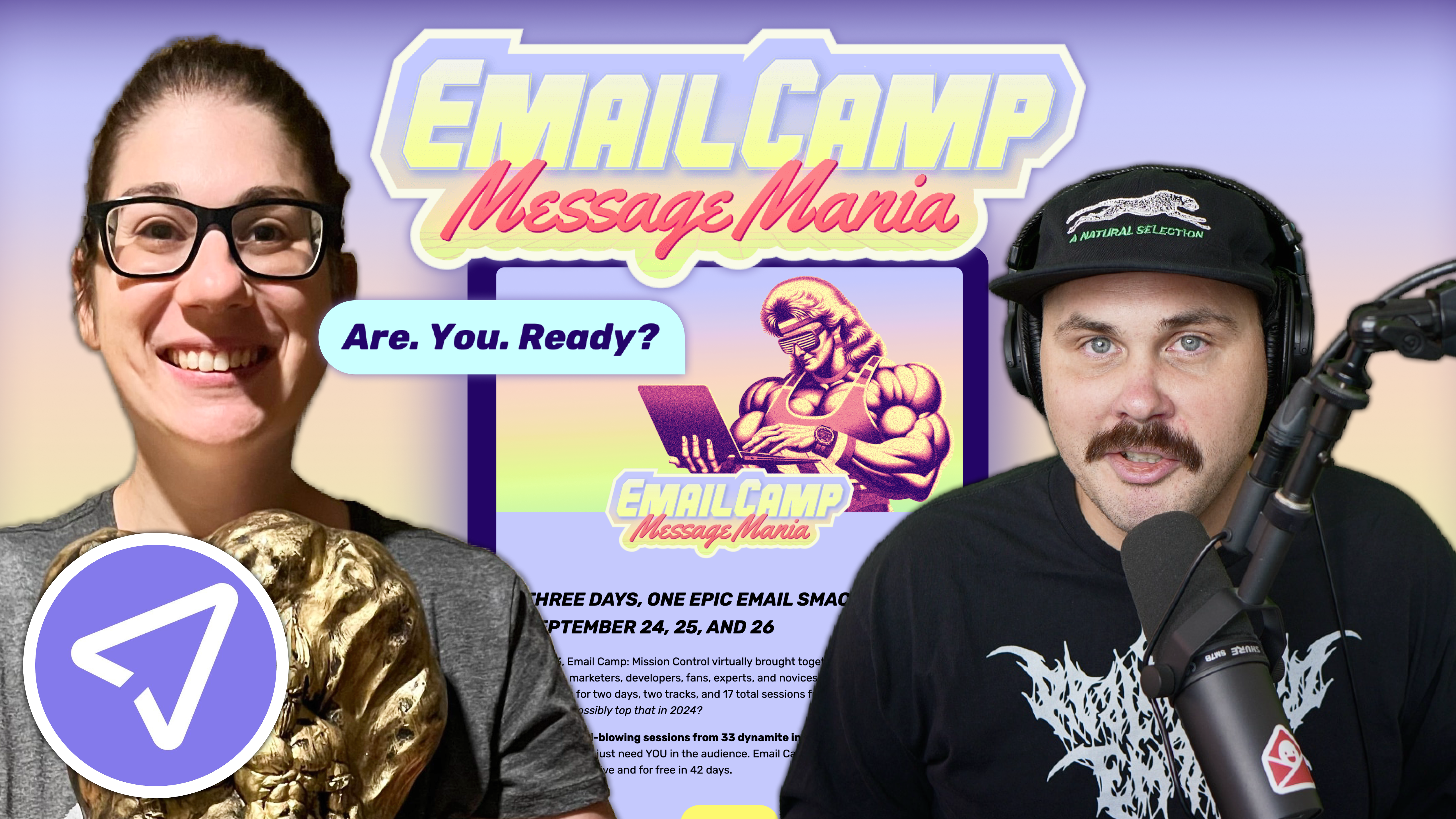
Email marketing deep dive with Megan Boshuyzen
Matt Helbig and Mailgun’s Megan Boshuyzen unpack Email Camp, showing how accessibility, live text, and smart CTAs turn event emails into signups.
November 15th, 2022
This week we look at Apple's emails.

What does great brand consistency look like in email?
For Apple, it’s about balancing world-class design with functional clarity — and sometimes, wrestling with its own scale. In this episode of Feedback Friday, Matt Helbig joins Tim Yeadon from Clyde Golden to break down Apple’s approach to email design, accessibility, and storytelling. From sleek product launches to seasonal campaigns and event invitations, they explore how a global brand maintains its polished identity while managing dozens of product lines and teams.
If you’re working in design, brand marketing, or email strategy, this episode is a deep dive into what it takes to make even the biggest brand in the world feel personal and cohesive in the inbox.
TL;DR
🎥 Watch the full breakdown or read the transcript for insights to strengthen your next brand email.
Matt Helbig: What's up, Email Geeks? Welcome back to another episode of Feedback Friday, the show that looks at emails and discusses why they are really good. Today I am joined by Tim from Clyde Golden. How about you introduce yourself, Tim?
Tim Yeadon: Hey, Matt. Thanks for having me. I am Tim Yeadon with Clyde Golden. We're an email marketing agency in Seatle. We've been in about five years now. We're just getting started. It's still much fun. Every day is just exciting.
Matt Helbig: We both picked Apple today, a pretty big brand. I'm nervous. What are your initial thoughts on what Apple does well and what it could improve on?
Tim Yeadon: We all know that Apple has a beautiful brand, the products are extremely useful and seamless, and they're built for us. What's fascinating is the gap analysis between what the product is and how they interpret the brand in email. The landing pages are lovely, and the campaigns are engaging, and then once we get into email, it's all over the map.
Matt Helbig: They have so many products. They have their product launch emails, Apple Fitness, iTunes, and Apple TV. So there are a lot of different brands under the Apple brand. Specific emails might get a little bit more attention than others. How many people might be on the marketing team for a big brand like Apple, and how can they keep it consistent across all the different products they offer?
Tim Yeadon: In the end, it's all just Apple to me, whether it's iTunes or some other sub-brand. I think you remember when you are marketing for a company like this.
You had set a handful of examples before we chose Apple, and one of them that you had sent was Nike, which deals with a similar scenario, and I thought they handled it well, in which there was always a consistency of that swoosh at the top. While I understood it was Nike, they were bringing in all sorts of different sorts of products and activities as they went. So Apple and Nike, in a certain regard, there's a parallel between those two. It's interesting to see when they have a campaign for a special event versus rolling out several iPhones they want to talk about. It's not easy to do, and it takes some discipline.
Matt Helbig: Definitely. All right. Well, we picked out three examples to look at. These are the top three most popular and collected ones on the site.
This lovely animation is here on that Mom's Day text. A very subtle animation, but it's only right when it loads, which I wish it would repeat every 10 seconds instead. I think this is an excellent way to capture someone's eye, but when you're adding too much in a GIF, and people wait like 10 seconds to communicate the message, I think that's kind of when email marketers go a little bit overboard with GIFs.
Tim Yeadon: I'm going to add to that. You have about three seconds from that subject line into the headline, and then if the subject line got me in and the headline doesn't load, you're likely to bounce onto the following email.
Would you happen to know what's cool about this layout? First off, because that CTA is transparent, they can use different colors behind it and get a nice contrast. They're bottom aligning the module type from the bottom up. They're building up. And so, as I scan, the eye consistently goes to the same place in the module, and it's easy to browse.
The type is nice and small. The images are pretty large. I can see the fabric of the band, which is lovely in something like this. This is a Mother's Day email, and we've all done things like this. This is a collection of beautiful things for Mom. You're not going to have a CTA right at the top. You're going to try to get people to bundle. You're going to try to get people to come into the site and look around, and you're just trying to solve a problem for Mother's Day. What should I get for my Mom?
In the subhead, I want to highlight those superscripts and asterisks. Some paragraphs in these have an asterisk and a number everywhere you go. There are claims that they're trying to protect, and there's a brand team, a campaign team, and a product team, but the actual lead for Apple is the legal team.
Everything you do probably has to go through legal, and they're just plastering asterisks all over this thing. So it's not very scannable. It's a little irritating, and it's a little off-putting. We've done lots of emails for banks and financial institutions, and there's not half the number of pieces pointing down at these various claims or just specific deals.
Interestingly, a standard message throughout Apple is legal. The legal at the bottom, the small boilerplate. Not a big deal, but I wish there could be a way that there weren't just so many superscript numbers and asterisks hiding in the messaging.
Matt Helbig: I like their use of color, breaking up these different sections into different products. Okay, this is their watch. These are accessories. This is another kind of device, and then more accessories. It's smart to break these up and still use live text. I know these buttons are images. It would be nice to see them try out a bulletproof button.
I noticed they had this sort of catch-all CTA, which I usually like to see. It's done with that plain text and with an underline hover effect.
Tim Yeadon: It's a rescue CTA. You could have placed something like that right up top. Some people get this, and they're like, right, let's look at Apple and see what they have.
Matt Helbig: After this, they transition away from those products to more, I guess, secondary messaging. I was impressed that this is still using live text.
Usually, I would've expected a banner like this. Someone might try to lock it up in an image. They have this fun little headline here, showing why you might want to interact with their site. So this is an exciting way to break out of these quick links at the bottom, like a navigation bar.
I was surprised these were links. I thought they were more like icons supporting the messaging, but it seems like a bottom navigation section.
Tim Yeadon: You need some emotional anchor to the bottom of an email that suggests. We're done. This does an excellent job of it.
I would also say the live body copy, "Get free no contact delivery for your gift," is centered. It's justified center type, which is about the longest amount of center justified type you can safely use and still expect people to read. So you can almost absorb that "Trade in an old device and save" without actually reading it.
Suppose you have 30 words in there. If you have 80 characters or more, you'll need a left-justified body copy so the eye can bounce back and forth and quickly scan. So that's something to be careful of, to use center justified type in short, short bursts, tops unless you don't want people to read it.
Matt Helbig: This works great for me. I think no more than three lines is what I think the threshold is with the center-aligned text. This section is advanced. It is a three-column layout. You're throwing in lots of information, but it's still scannable and easy to read.
So I'd like to drop it down to two or give it more room to breathe. But I think they use white space effectively enough to make this work.
Tim Yeadon: It's my job to get you to the site quickly. It's not my job to teach you anything in an email like this. This email's a little long. There are a few pieces about three-quarters of the way that don't feel like the rest.
Matt Helbig: We have a product launch email.
Tim Yeadon: Out of all the emails you sent, this one annoyed me the most. The center type up at the very top. The description is a list of features. I'm still trying to determine if I've read all four lines. I almost need to close an eye to read these things.
Matt Helbig: But there were a few things on this email that I did like. It was interesting to see them use those rounded corners. It softens the imagery and makes these feel like individualized cards.
Tim Yeadon: There's an excellent resonance with the shape of the device itself.
Matt Helbig: Many people say, Oh, I want my emails to be like Apple. You might not have this kind of stunning product photography or the ability to bring in color palettes like this. So I always give them credit for doing their own thing and trying to surprise and delight in the inbox.
This is a long scroll email. I know this is a product launch email, and everyone wants to get their little piece of the pie, something like an email like that, but there's just a lot of content within this one. So it may be too much for me.
Tim Yeadon: Someone opens an email, and you have about three seconds to get their attention. You've only got a few more seconds to decide to click through. People will scroll. People on their phone scroll on Reddit all day long. They will scroll to the bottom if interested in an email and the content.
When I say when they're too long, or the files are too heavy, and they get clipped, that's a fear. But I don't fear creating a long, tall skyscraper email that people will wander through and be interested in.
There isn't anything wrong with that. Thumbs are strong at this point, and we can scroll forever. And so if you can get them to the bottom, that's great. But, unfortunately, most people aren't going to the bottom of promotional marketing emails.
Wow. Look at this.
Matt Helbig: Yeah, I know. I was going to say this is like a CVS receipt. It just keeps going.
Tim Yeadon: I kind of like a Marvel movie. I want a module down at the bottom with some joke or something explaining what will happen in the next product launch. So if I got down here, I deserve it.
Matt Helbig: Exactly. All right, we got a fun one for the last email that we're going to look at. A little bit of a webinar, too, because this might have been a virtual conference this year. I liked the memoji people and the code reflection in the eyes. That's a cool touch.
Some of their event invites are just one large image, but they use live text here, which is fantastic. I like that it takes over the entire email, and I like the dark-themed email. What do you think about this one?
Tim Yeadon: I like the art too. Those are cool. We have a centered body text again, then "scroll down for more." I'm in an email. There's nothing else I can do. How about a CTA to register? Yeah, that would be nice right there. You have all of this not quite scannable centered light contrast body copy that's pretty small.
I have a copywriting background, and I've written a lot of CTAs. "Learn more" is the lowest common denominator of CTAs. It doesn't ask me to do anything. It's like I need a CTA there and "learn more." The only thing worse than "learn more" would be "click here" because that's the only thing you can do with the button is "click here," and then that's just a mystery of what's going to happen afterward.
But realistically, "register now" is maybe a little bit stronger. If you took this content and placed it into the Mother's Day email, I bet it would perform better with short, easy-to-scan blocks. Yeah. In a flow that makes sense with a nice big headline at the top and CTAs designed to get people to do things. It would be fascinating to take the same content and test it.
Matt Helbig: Well, that covers most of the Apple emails. Go on to Really Good Emails and look at other examples. They do a lot with email. It's interesting to see the different layouts and content they use to connect with their subscribers.
All right, Tim. Do you have anything to plug? Do you know where we can find you online?
Tim Yeadon: We're at clydegolden.com all day, every day. Making great emails.
Matt Helbig: Yeah, you all have great blog posts up there. You have featured Really Good Emails in some blog posts, so give those a look.
Thank you so much, Tim. It was fantastic to talk with you today. Have a wonderful week.
Tim Yeadon: All right. I hope you have a nice day. Bye.
Categories:
Feedback Friday
Matt Helbig and Mailgun’s Megan Boshuyzen unpack Email Camp, showing how accessibility, live text, and smart CTAs turn event emails into signups.

Accessibility, applied: Matt Helbig and Kelsey Yen reveal how inclusive design turns real emails into better user experiences.
Dive into the world of unmatched copywriting mastery, handpicked articles, and insider tips & tricks that elevate your writing game. Subscribe now for your weekly dose of inspiration and expertise.