“Beauty is in the eye of the beholder,” as some theologian-people would say. But guess what? Not everything is beautiful. For example, that strange conjoined twin thing from Total Recall or the zombies from Walking Dead which are still moving even though most of their bodies have been eaten away. Gross. Not even a face a mother could love.
Another thing that isn’t beautiful? A poorly designed email. You may think that an email wouldn’t be in the same realm as the first two examples, but in reality, people’s eyes divert faster from a bad email design than the other forms of visual stimuli mentioned. This is because the average individual spends less than a few seconds judging if an email is relevant, important, or trustworthy — with design playing the biggest factor. In cinema, you are compelled to keep watching, even if it grosses you out. In books, you want to know if the main character survives. In email, you could care less… which makes that really scary sh*t.
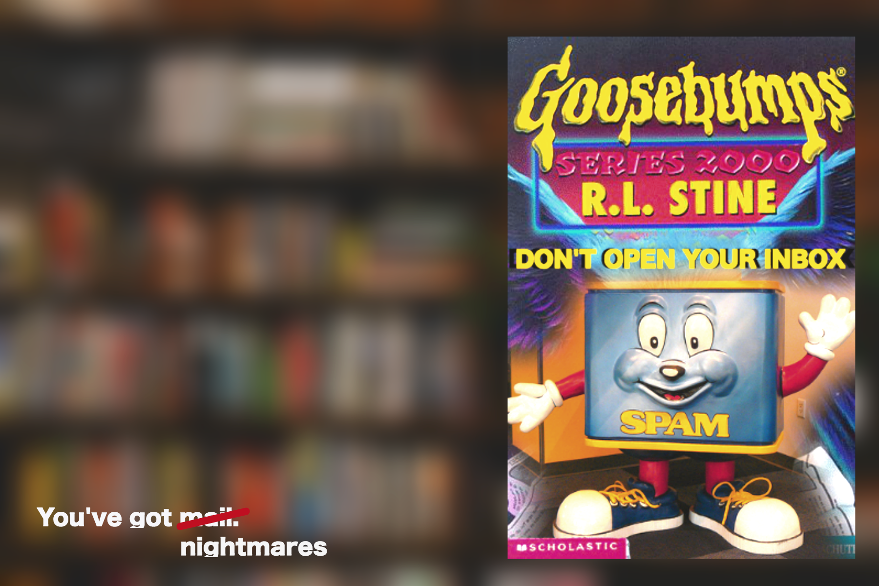
I can see the Goosebumps title now:

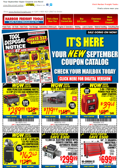
So what makes a design in email really bad? Well, there are a lot of elements that create visual confusion or disgust. But let’s focus on the biggest elements that you can change to make your emails more compelling and soft on the eyes so they don’t look like this:

Oh! The Horror! So many fonts. So many colors. So many text boxes you can’t read on your phone.
1. Not Enough White Space
Whitespace is often referred to “negative space,” but shouldn’t be thought in a negative way because it is amazing. Remember when you learned how to write and you would put your finger in between words to make sure you spaced out the letters from forming different words? It is kind of like that. It gives you breathing room between elements, such as graphics, columns, images, text, and margins.
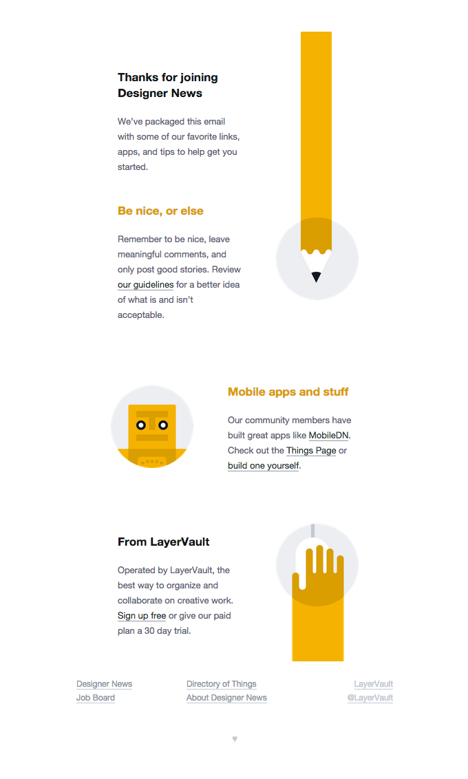
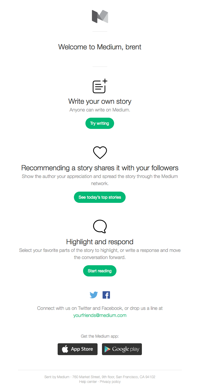
And even though our examples below use actual white space, it can be any color — black, blue, magenta — except for brown. No one likes the color brown. See how the spacing between columns, text, and colors below in Designer News’ & Medium’s onboarding email are well spaced? Even without divider lines, you can clearly see where a content element starts and stops.


A designer’s main goal is to make an email look simple and to un-clutter the visual frenzy that often pollutes the message. This can be done by stretching it out and not trying to fit it all “above the fold.” So while you are thinking of what goes into your message, develop layouts that are easy on the eyes and that make people want to keep reading. The more simple, the better when it comes to white space.
Also, keep in mind that to make text readable you need more space between letters and headers (more on that below). Instead of stacking tons of information to take advantage of all of the space you have, you can have two or more nicely spaced rows and columns showcasing only what is truly important to the readers.
2. No Hierarchy
Like white space, creating clear groupings will establish a hierarchy that is easily scanned. The best way to think of this is establishing a primary message and a secondary message. For example, in this post, primary messages use a larger, bolder font, while the supporting (secondary) message is typed in paragraph format. You are probably thinking that this is where it gets boring, but it this is the most important part of an email because the sizes and colors you use will help queue your readers’ minds into what is important and what can be skipped (kind of like what you are doing right now). So before I lose you, here are some more examples to the point.

Why is this email great? It shows that hierarchy isn’t always text. This uses a bold image, then moves into a larger header, a smaller supporting paragraph, and then to an orange Call-to-Action (more on CTAs below). With such a bright color CTA, you would think that your eye would go straight to that, but it naturally flows downward as it should.
When in doubt, think of the squint test. While squinting at the image, what can you see clearly and what seems important to you? If you can’t make anything out, think of using some more white space and creating some difference in sizes and colors.
3. Unclear Layouts
How many columns should your email have? 2? 3? 7? Definitely not 7. And actually, 3 is pushing it. We are fans of the 1 column approach, but see plenty of 2 column layouts that look great. And sometimes you can trick people and make them think that it is 1 column, but it is really two. Take the one below:

As you look at it, the rows are very apparent due to the background image changing colors. But more subtly, the switch between image and text is how this email is laid out. It uses the famous Z pattern, where your eye starts at the top left, moves right, and then is horizontally reversed the next row down (alternating between images and text). The content isn’t too heavy either, allowing the email to look uniform.
We have similarly been running a one vs. two column test to our subscribers and the results vary based on content (images in both columns, text in both columns, mixture of text and images) and region (our friends on the other side of the pond have been engaging with two column more than one column, for example). Definitely something to play around with.
Here’s another layout that is extremely simple to replicate:

The receipt has a few different columns — the billing and payment columns and then service and price columns. Just because you have multiple tables, doesn’t mean that the widths have to stay the same from one table to another.
4. Contradicting Fonts
Any designer will tell you to not even mention the Comic Sans font — not even in a joke. That is how bad the font is. It is kind of the Voldemort of the font world. But there are a lot of other good fonts out there. Where people go wrong is at the place where they use too many fonts or font styles. Be mindful of leading, kerning, and font sizes. There’s a really in-depth article from Anna Yeaman on the use of font in email if you are interested. Again, this is where a good squint test comes in.

When it comes to size, our general guidance is size 16 (depending on font) or higher. Also think about your visual hierarchy when aligning and sizing your text. Reading distance is a key consideration when choosing font sizes. On the desktop, with an arm’s length between me and the monitor, larger is usually more comfortable while considering how many characters exist on one line and the what the leading line height is (around 60 characters and 1.5x the font size respectively).
5. Boring Images
To use another cliche term, “an image is worth a thousand words.” But often, especially with stock imagery, the phrase would be “this is a boring image worth a thousand worthless words.” If you are going to put an image in an email, make sure it is supplementing the message and make sure you didn’t just download it from some stock website that everyone uses. If you aren’t making it rain in dollar bills, chances are that you also don’t have the budget for a photographer or high-end photo-shoot. But there are still places to grab free, awesome images — like Stocksy, Death to the Stock Photo, Unsplash, and many others.
As you notice, when you have a great image, you don’t need to use that much text. The image here is a high impact statement, supplemented with a few words and a contrasting CTA.

You can also take a boring, lifeless product and create a design with it that speaks well for itself. For example, take this one from Apple:

While we hate using the term “best practice” (because we are strong proponents of testing everything), these are some pretty unanimous recommendations of what to do with your images in your email:
- Your email should be between 600 and 800 pixels wide. Anything wider and the kids will probably make fat jokes about it. (Also, many clients have this as a standard.) If you want to get crazy, you can make it edge-to-edge and code for all different types of media queries so it can be larger or smaller. Eat your heart out.
- Don’t design an email that is just one big-a** image. Even slicing that image down into smaller images doesn’t perform as well. Try to add in some text in there to break it up.
- Account for fat fingers on mobile devices — allowing for ~46x46 hit areas for links.
- Add support text to all images to help your email get through spam filters. It doesn’t add a ton to get it through, but every little bit counts.
- Gmail clips emails after 20540 characters of code, or roughly 20kb of size. So make sure your email is smaller than that, including images.
- (We are fans of compressor.io and tinypng.com)
6. No Clear Call-to-Action (CTA)
Just like how your email needs a purpose, so does your CTA. What do you want your subscribers to do? How will they know what you want you to do? Why should they do it? Emma has a great reference guide if the points below are too short for you. Or you can read our research on all Email CTA buttons that we presented at #LitmusLive a couple months ago.
- Design: Keep these buttons big enough for big thumbs like ours to click on them (Apple suggests 44 pixels) and give them spacing from other elements (images and text). You’ll want to place the most important CTA early (from our tests, the first CTA is clicked on the most) and provide enough contrast from the background and other text that is apparent that they are focus points. Blue seems to be the trendy color of choice, but it probably doesn’t matter that much. Go with your gut and test it out.
- Language: The biggest mistake is using a weak, passive call to action. The classic example is: “click here.” There’s no incentive and there’s no indication of what will be waiting for them after they do (if they ever do). So what you should be doing is including some active verbs that describe the benefits or create some urgency. But at the same time, keep an eye out for “high commitment” CTAs, such as “Buy Now.” Do you really think that someone is going to buy something just because you sent them a few sentences and an image in an email? Maybe. Even better, use low commitment CTAs that doesn’t infer a high amount of time, stress, or money. Think along the lines of “learn more” but something a little more interesting than that. From our CTA research, the most used verbs are: Get, Shop, & Take.
- Image vs Code: If you don’t know how to code, then using a button image will accomplish what you need to. However, the main problem with image buttons is that many email clients block images automatically. This means that your CTA (the most important part of your email) won’t be seen. So we encourage using a “bulletproof” button — which is a small snippet of HTML and inline CSS that creates dead-sexy buttons that render well across email clients even with images disabled. This is why we also campaign to use text outside of your images.
While the email below from InVision is a little longer than what we usually suggest, their CTAs are non-disputably the sexiest we have ever seen.

It Shouldn’t Be Found in the Horror Genre

In the movies, the storyline keeps us glued. In the inbox, nothing keeps us glued. However, when you start to bring the elements above together, you create reasons for people to look and interact with your emails. And that is the entire goal for a good design. So whether you are using a template or designing your own email, remember the elements above to make for a great experience that doesn’t scare your readers off. Or you can just offer them candy instead. That seems to help.
