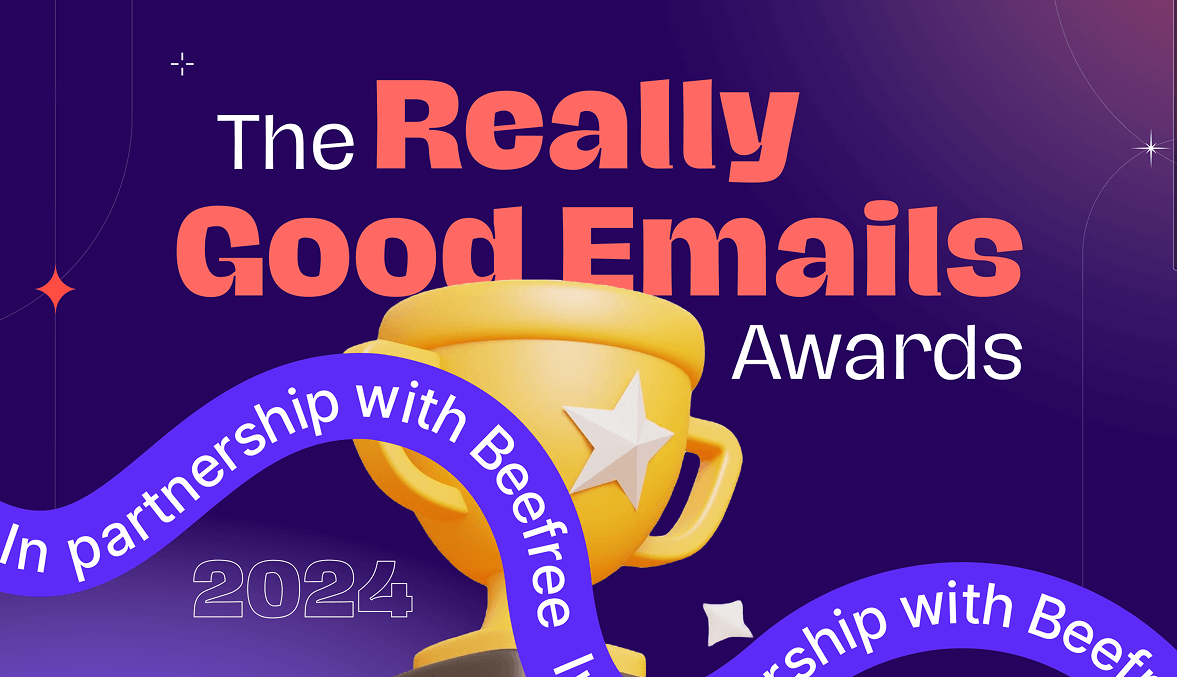
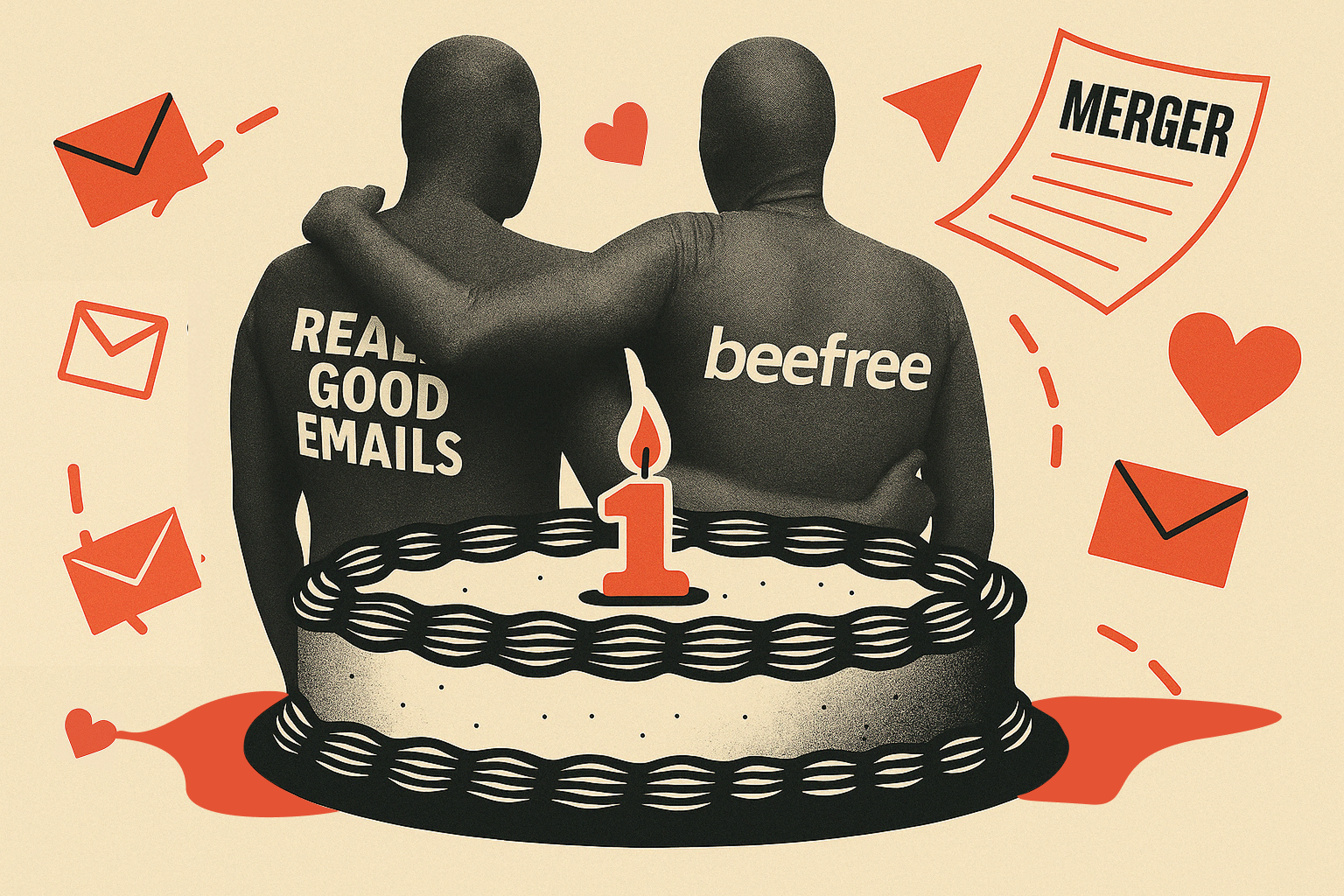
Matt Helbig: Welcome, everyone! We are thrilled to introduce the first-ever Really Good Email Awards. You might be wondering, "Why now?". Really Good Emails has always wanted to launch an awards program, but we never had the time due to our full-time jobs. Now that Beefree has acquired us, we finally have the opportunity to make this happen.
How did we select the winners? We analyzed your favorites and examined the emails you collected, searched for, and clicked on. Additionally, we looked into emerging innovations and trends. Our goal was to identify brands that truly broke the mold.
I am Matt Helbig, Integrated Marketing Manager at Really Good Emails and Beefree. I'll let Logan and Kelsey share about themselves as well.

Logan Sandrock Baird: We love talking about ourselves. Logan Sandrock Baird here, Senior Community Evangelist with Beefree and Really Good Emails. I'm delighted to be here among my magnificent co-hosts, and all you marvelous email peeps out there.
Kelsey Yen: Hi, I'm Kelsey Yen. I'm the Senior Email Marketing Manager at Beefree. I'm so excited to be here. I love looking at beautiful emails, so I can't wait to see who wins.
Matt Helbig: All right, jumping right in, we have the award-winning categories. We picked 11 different categories. They best represent what we thought was currently trending on Really Good Emails.

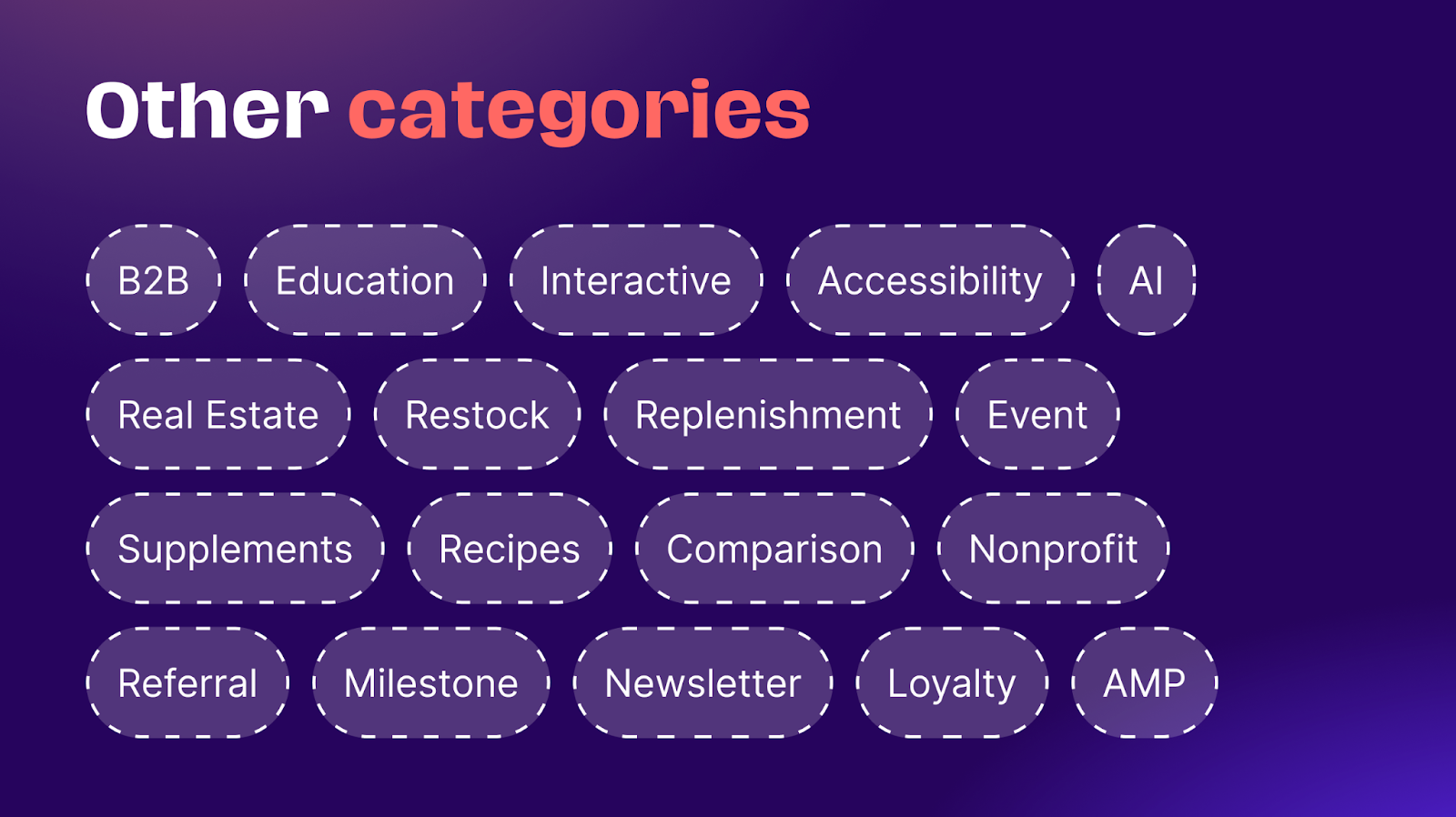
Let's look at the categories we won't explore. Fingers crossed, we can add them in for 2025! We left them out this time because we didn't get enough submissions or information on those topics. We couldn't fully cover B2B, education, interactive content, and AI. We also saw interest in restocking or replenishment emails, recipes in email campaigns, referral programs, milestones, and loyalty programs. Hopefully, we can cover these topics better next year!
Logan Sandrock Baird: To reiterate your point earlier, Matt, you all chose these emails, essentially from clicking on them and saving them in Really Good Emails. So, if you see something you like, you helped make that happen. And if you see stuff that you don't like, you also made that happen. So, it's a collective sense of responsibility for what we celebrate today.
Best Welcome Email Award
Matt Helbig: Let's start with the first Welcome Email Award!
Logan Sandrock Baird: Yes, gentles, we can say that we are all in the club right now, and I want to tell you that we are all fam now.
Welcome emails are a foundational part of any email program. They are usually the first touch or contact people have with your brand, and they are how you make them feel welcome. They help set the expectations for what they can expect—cadence, type of content. Let's get into it.
Matt Helbig: We have some honorable mentions that were close to making the cut but were not the winners. What elements stood out for you with these?
Logan Sandrock Baird: I think our runners-up here share what I think is a really essential element for any welcome series: they have a little progress bar in each of them. We love to see that because it gives recipients a quick way of seeing what they have coming up. It sets the expectation for what other emails they'll receive and what they'll cover. It assures people that there's a plan.
Going has that right at the top, with a little bar highlighting each one. Then, there is LifeSum, with the progress bar and a breakdown of what you can expect coming up. Those are two great examples of those elements.
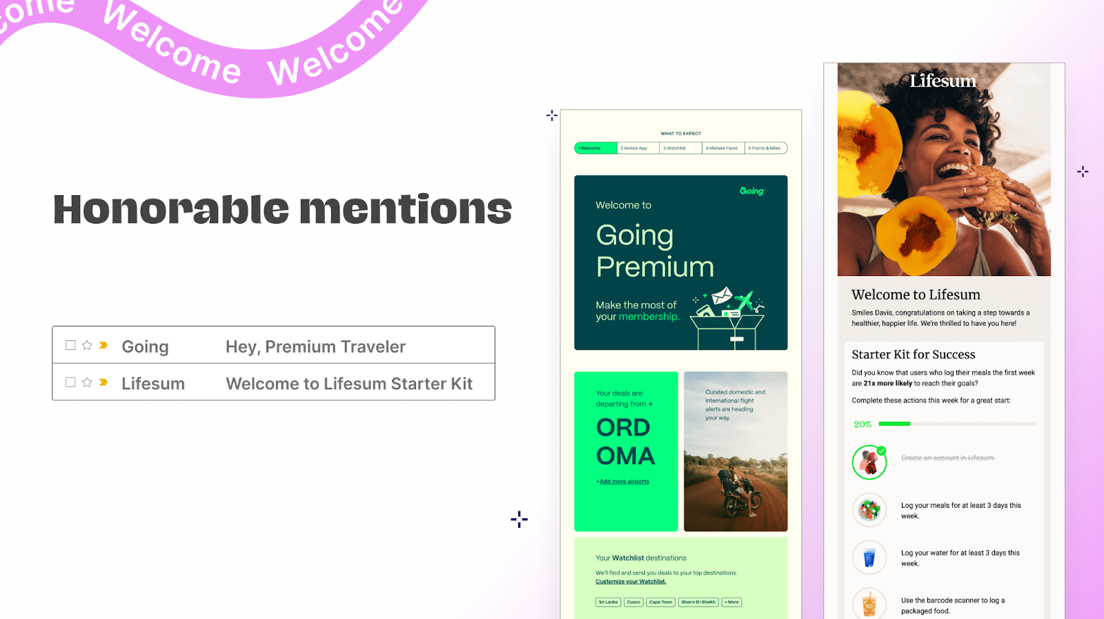
Matt Helbig: Yeah. These stood out as great welcome email examples. Like you said, Logan, it's the first impression someone has of your brand. These emails are some of the most opened out of all the ones you send. Having some personalized elements here, bringing in some information, and then showing them where they're at during that onboarding process is a way to make your email stand out.
Logan Sandrock Baird: Three, two, one, and the winner is... Miro. Miro is such a magnificent collaboration tool. And let's dig in briefly to what made this email stand out. Similarly to the two runners-up, they also had a quick start and a clear sense of laying out what steps to expect. They break it down into just three steps. We love threes. As humans, threes are easy to remember, and there's a comforting cadence to it. I love their hero image here, a miniaturized version of their app. So, it already gives you a sense of being in the app. There's a lovely sense of visual cohesion and continuity there.

Matt Helbig: I love the UI elements in the hero image. It's a unique part of their brand. Yeah, it stood out to us. This campaign is one of the most popular emails saved and collected on Really Good Emails. Throughout this email, they do a great job setting the stage for what's next with their brand once you onboard to their site.
Logan Sandrock Baird: We can take a little closer look here. So, digging into the three easy steps. Step one is to create your first board. That's pretty straightforward, and the hero image sets you up for what to expect when you get in there. Then, it encourages you to start shaping your ideas using the tools once you've created that board. The third step invites you to invite collaborators. So, it's already extending its reach by encouraging people to collaborate. It's a collaborative tool, but it's expanding the audience reach through that welcome email with a simple step. I love that. Does anything stand out to you all?

Kelsey Yen: The use of live text—making sure that it's accessible and people know their next steps and what they can do to get the full use out of the product. Miro does a great job of staying consistent with their branding. Across the whole journey, you're continuing to grow and get more invested in the brand. I love the imagery there.
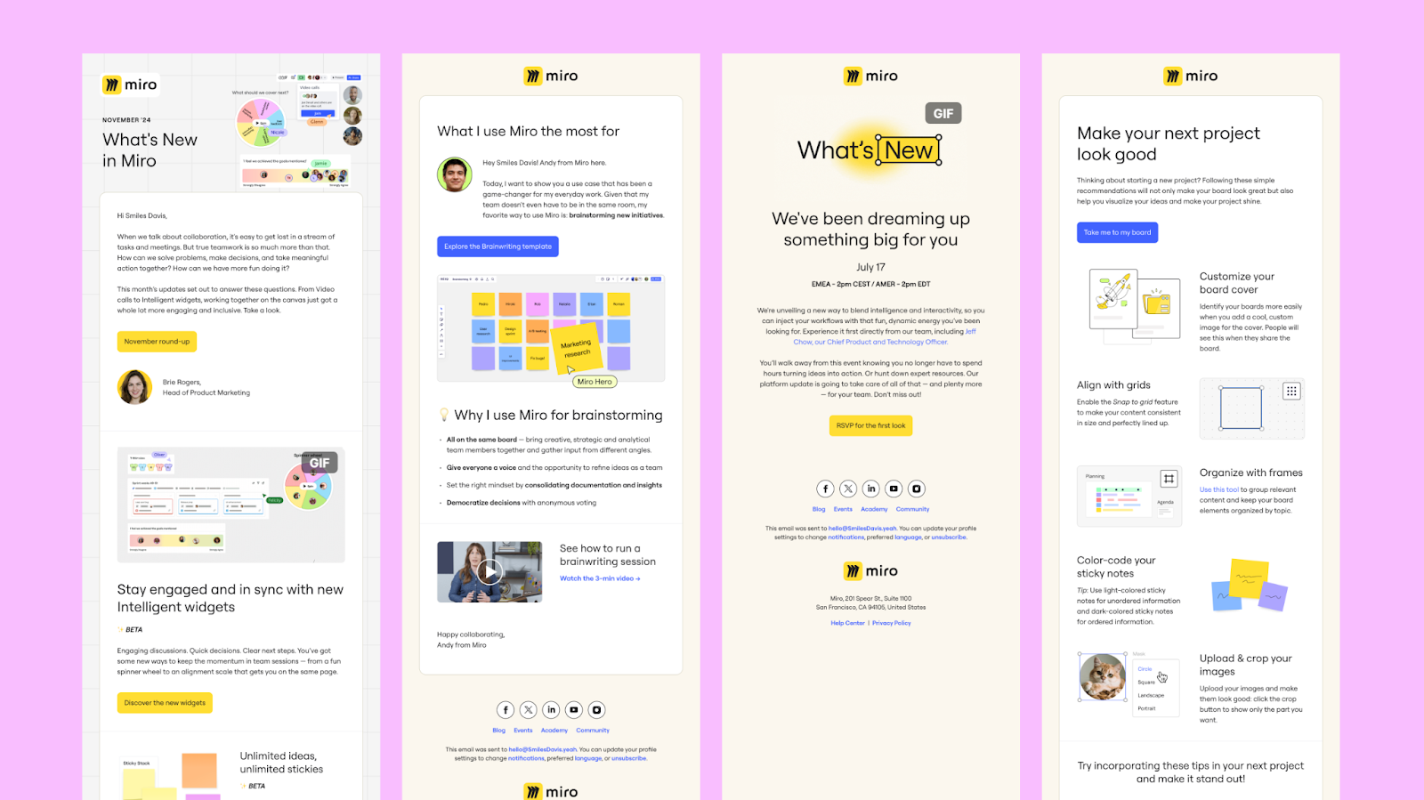
Matt Helbig: One thing that stood out to me in that previous welcome email was the inclusion of clear FAQ calls to action. For instance, if you're having a problem with the product, you're guided to contact the support team. I appreciate seeing that in an email—it reassures recipients that someone on the other end is ready to help. Especially in SaaS, that kind of support visibility is important.
Logan Sandrock Baird: Absolutely. They've also done an excellent job of integrating their product seamlessly into the email. Even the 'What's New, What's Next' GIF, which is delightful, uses a mock-up of their text tool. It's thoughtful consistency throughout. The best thing about this email is that even if you remove the Miro logo, you'd still recognize it as theirs. That's brand identity done right.
Best Product Launch Email Award
Matt Helbig: Onto the next category—Product Launch: The Big Reveal Award.
Logan Sandrock Baird: We love product launch emails, especially those with a countdown and reveal. Let's take a look at our runners-up.
Matt Helbig: Awesome. We have some honorable mentions here, with Freaks of Nature and Google stealing the show.

Logan Sandrock Baird: They both embody a core principle for me with a successful launch email: respect for the time and attention of the recipients. They're both brief and to the point.
Freaks of Nature incorporates a product image and a human image using the product. We love a very straightforward, descriptive blurb followed by a strong CTA.
Google simplifies even further. It knows that interested people will click on it regardless of how much description is needed, so it keeps the description brief. It does give you the cost and then encourages you to pre-order.
Matt Helbig: I love the big CTAs in front of your face. It just makes it super clear. Like here's the product, here's the launch, jump into the product. So that's cool to see. And we're going to keep moving to the big reveal.
Logan Sandrock Baird: Three, two, one. And we got this one from Volkswagen. What is so great about how they approached this is that they offered the user, the recipient, an immediate point of connectivity, interactivity, and choice. They're already inviting the user to imagine what kind they would like. They're already giving them this autonomy and this sense of imagination. That carries over so well. What do you all think of this?

Kelsey Yen: I love it. Just the fact that it's so interactive and that you could click and change colors makes me want to know ‘What else’? What else can I do? And so it makes me want to click into it, go to the website, and see what other customizations are available. It's a fantastic use of color and interactivity to get people to click. It's not just a boring 'Here are features' email. They took it to the next level, and it's very creative. I love it.
Matt Helbig: I'm sometimes a naysayer on interactive email. Sometimes, brands do it because they want to do it or because, you know, someone told them it was cool. But I like how easily usable this email is, and I love the change in the CTA colors. Little touches like that make the interactive portion valuable and beneficial, adding something to the email.

Logan Sandrock Baird: This really embodies one of my favorite email structures. You've got an initial opening blurb and an immediate call to action for people ready to jump in without needing more information.
They're excited and ready to connect. But then they offer more detailed context—not a ton more in this case—as well as the 'Explore Features' CTA, which allows people like myself, who adore more context and detail, to explore further. You also get a good sense from your audience of who's willing to make that initial jump and who wants more. That lets you segment and create dynamic content that suits them better further down the road.
Matt Helbig: If you're interested in how this email was created, check out the code view on Really Good Emails. You can explore the different fallbacks, the types of interactive radio buttons used, and how these elements were coded. It's always fun to discover how things are built behind the scenes.
Best Re-Engagement Email Award
Matt Helbig: This might be an award that my ex should have gotten.
Logan Sandrock Baird: Yes, for Re-engagement emails. Now, we're defining re-engagement a little broadly here. It's not just people who've gone inactive, but all the ways we try to encourage people, maybe those who haven't interacted quite as much, to interact a bit more. So, let's take a look at our magnificent honorable mentions.

Nonny is a great non-alcoholic beer. When they restock their online store, they send out an email to notify interested customers. Since these beers are produced in limited quantities, they want to ensure that those who are interested have the opportunity to order. This email features a dual call to action, which can be effective. It allows customers to either shop online or, if they prefer, find Nonny at a local retailer. After all, who wouldn't want to discover their favorite Nonny in person? This feature helps customers locate where they can find it locally.
Tillamook takes a similar approach—straight to the point. It is a survey asking for preferences. So, re-engagement here means trying to get people to offer what they would like to see from them and then tailoring their content slightly more.
Again, I love both of these—they're short, to the point, and respectful of everybody's time and attention.
Matt Helbig: According to the RGE search data, 'back in stock' or 'restock' emails are a good way to promote a product without launching it or having a sale. They get people to re-engage with your product.
Also, a quick and easy survey is a great way to communicate with your customers and get feedback about their products or experiences with your email. We recommend adding these two types of emails to your repertoire of email marketing.
Kelsey Yen: Especially when you ask someone to take a survey—now I'm thinking about cheese again, and now I might want some more cheese. You're reminding them of all the wonderful times they've had in the past. So, I think it's an excellent opportunity to re-engage. Great job.
Logan Sandrock Baird: And the big reveal for re-engagement is Sometimes Always.
This email could be overly sales-oriented and impersonal, but its writing—the strength of the copy and its organization—makes it feel much more personal.
"We noticed you checking out some very nice bottles, and we must say, you've got great taste. We're impressed!" They could have used a phrase like "Limited quantities, buy now" to convey urgency, but this wording feels more like a friend saying, "Hey, there aren't many left. You should probably act quickly."

Matt Helbig: Yeah, I like the very personalized tone. It's relaxed. It's casual, like, 'We noticed you checking us out.' That is an enjoyable subject line. Another trend we see with re-engagement emails is this kind of browse-abandon email marketing.
We're not showing you your cart; instead, we're showing you other recommended products. It's hard to know precisely where this one might hit in the flow, but it can be another way to contact people outside of the usual abandoned cart emails you see all the time.

Logan Sandrock Baird: They have a strong sense of their brand style. Their use of color works very well here, and they keep it simple. They're like, 'Here's an initial shop now,' and then, 'Here are some specific bottles that might be recommended for you to check out.' There's not too much to dig into there.
Matt Helbig: Just getting a complete view of their brand, they do some really fun stuff. That was an important part of choosing the awards—not just picking one email but looking at the brand holistically and how they innovate across all their emails.

Kelsey Yen: This is a trend that I've been noticing too: these fun fonts are not sticking to the norms of, you know, the two or three fonts. They're going for it, making it a part of their brand, creating that visual identity of who they are with their fonts, and having fun with it. Plus, the interactivity and the real photography—they're not using stock photos of people drinking. It's their brand and their bottles, and they're getting personalized with it.
Best Pet Emails Award
Matt Helbig: Moving over to Kelsey's email picks for the awards with the Paw-some Pet Care Award.
Kelsey Yen: Now we're moving on to pets. These emails had your tails wagging and your purrs roaring. We have Ollie and Little Beast as the honorable mentions. One of the things that stood out to me, especially when discussing a pet brand, is that pets are part of your family. These are your loved ones. So, anything you can do to emote that emotional feeling stands out.
The use of real photography, having their pets eat the food and wear the clothes, helps you build that emotional attachment to the email, which is lovely. Then there is just great use of color to keep it looking authentic and fresh.
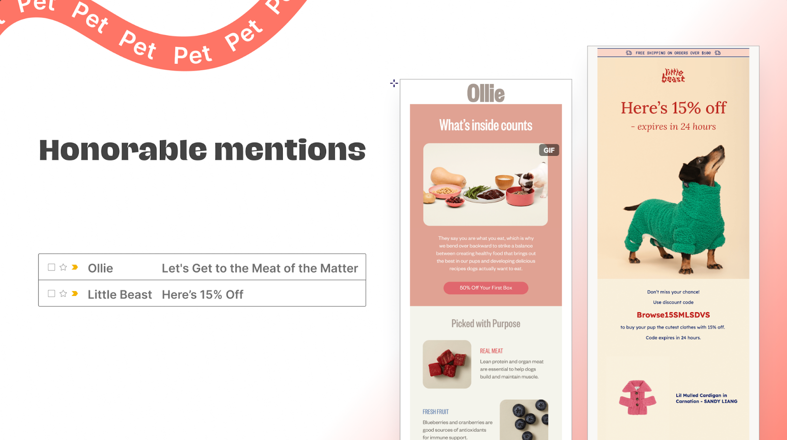
Matt Helbig: Yeah, pets were a big search term on Really Good Emails in 2024, a big increase year over year from 2023. So it's cool to see different emails and types of brands innovating in the inbox. Like you said, making it feel slightly more personalized towards your pet.
And our winner may reveal that as well: Sundays.

Kelsey Yen: This is the best in breed for their category.
Sundays did a nice job of keeping it very simple and clean but also driving you downward and making you want to read the full message again. I think it's something we noticed in the beginning too—it's the real photography with the real product and not using stock photos. And then again, with the other imagery, like people with their pets, it's building a community. It's building that authenticity—all the things that we love in brands.

We want to see real people wanting them. Another trend that we've noticed is that ticker tape with 'Get 50% Off.' That's been everywhere lately. Using trends for a simple message, I feel, is a way to boost engagement, and it's a great use of that.
And then again, very simple layouts but consistent branding throughout. I think they do a fantastic job of knowing who they are when they hit your inbox. Whether it's an order confirmation, a welcome message, or a sale message, they all follow the same brand guidelines.
It could be a very simple message, but they go the extra mile to make it more personalized, to make it more inviting. The color blocking drives you down the email. So, great job.

Best Outdoor & Travel Emails Award
Matt Helbig: The Outdoor and Travel award. These are the virtual voyagers. We're looking for emails within the travel industry that got us excited about the great outdoors, and getting us motivated.
The honorable mentions are Patagonia and Airbnb. Patagonia, obviously an apparel brand, is not pushing its apparel in this image. They're using emails to build that lifestyle, to get people excited about travel.

And then, when you do travel, what are you going to wear? Patagonia, of course. They do a really good job of building that lifestyle, growing their community, getting people excited about the brand, and building loyalists.
The same goes for Airbnb—sorry to sound like a broken record, but once again, it’s all about the imagery: real vacation photos from real people. It’s that mix of social proof and vacation envy.
I love that. Instead of just saying 'Here are some great places to go,' they're really showing you a lot of people having fun on their vacations and giving you that chance to want to dive deeper into a location you may have not thought about before.
It has a very simple layout, but does a very strong use of imagery.
Logan Sandrock Baird: The point you’ve made about photography—again and again—really speaks to a bigger trend: people crave things that feel authentic and personal. Generic copy, stock photos, and cookie-cutter illustrations just don’t land the same. Real photos help you actually connect.
Matt Helbig: I love Airbnb, a very popular search term on Really Good Emails. They have so many different types of emails—mainly promotional, but they also contact hosts and guests about their stays. Plenty of fun, creative examples to dig into from a large-scale email program—likely translated into multiple languages. It’s a big operation, which makes it extra interesting to analyze at scale.
And the big reveal is…
Kelsey Yen: AllTrails + Calm. It’s a collaboration email—which you don’t see often—so I love that this one stood out. It’s a thoughtful partnership that highlights both brands in a meaningful way. Instead of just promoting products, it promotes wellbeing and the shared values behind the brands. Emails like this help build community and lifestyle, using personalization and smart design to really drive the message home.

Matt Helbig: I love how this one is laid out. Like you said, it’s always cool to see how a collab email does justice to both brands.
But AllTrails really stands out in the travel space with next-level personalization. It goes way beyond just a first name in the subject line—they’re pulling in local trail recommendations, which makes it feel personal and relevant.

That kind of detail draws you into their product, The Route, even in what might seem like a more promotional email. Overall, they’re just a super exciting brand to watch—mixing product-focused messages, sales, and standout design across their emails.

Best Drinks Email Award
Kelsey Yen: Drinks, drinks! The Endless Cheers Award. It's such a lovely name for an award. These are all emails within the beverage category, focusing on what performed best.
Matt Helbig: Drinks are surprisingly a big category on Really Good Emails, for sure.
Kelsey Yen: Is it surprising?
Matt Helbig: People love drinks, I guess.
Logan Sandrock Baird: Matt, do you have a thought about beverages that you want to share?
Matt Helbig: I do. Maybe beverages could be a scam. You don't always have to buy drinks all the time. Water is the best beverage. What do you think about these emails?
Kelsey Yen: Obviously, they’re a scam—kidding! I actually love beverages. I get thirsty. I drink things. And I love these emails. Beverage brands are really stepping it up—fun, bold graphics on the bottles and packaging, and now they’re carrying that same energy into their emails. They’re bright, vibrant, and super eye-catching. Take WildWonder: even a simple founder’s note becomes a branding moment, with big headlines, playful wave designs, and a ton of personality.
Another trend we’ve spotted is brands including recipes in their emails—which I love. It’s not just about selling the product, but showing how to use it in real life. We’ve also noticed a rise in black borders around email designs. These brands are doing a great job of tapping into trends while still putting their own unique spin on things.

Matt Helbig: Yeah, I love the color palette in this Bored Cow email. For a welcome message, a note from the founder is becoming a go-to—and for good reason. It adds personality and storytelling, which works especially well for nonprofits. It’s a great reminder that there’s a real person (or team) behind the brand. A thoughtful, personal touch—especially in this space.
Logan Sandrock Baird: And three, two, one…

Kelsey Yen: The winner is Athletic Brewing. Once again—really strong hero images. That’s been a consistent trend across all the winners: bold visuals, big fonts, and headlines that hook you right away. They’re smart about weaving their branding into the email itself, making it a core part of their email identity. And those testimonials? Just a lovely touch of social proof.
Matt Helbig: I love this one—everything just blends together so nicely. They’re tapping into a few different trends, like that 'back-in-stock' messaging right up top, which pulls your eye down through the email and into the CTA. Plus, those little testimonial snippets are a great touch—especially in a promo email. For a product you might not expect to have standout emails, they consistently keep things fresh. Whether it’s seasonal themes or new launches, they do a great job of mixing it up while staying on-brand.

Logan Sandrock Baird: They’ve nailed consistency with their branding—not by sticking to a strict, limited palette, but by using a broader range that still feels totally recognizable in every email. The logo placement in the top left is a smart move, and repeating it across different backgrounds really helps with brand recall. They also balance their calls to action really well—with something quick and punchy up top, and a more relaxed CTA further down. I’d still love to see some left-aligned text here, but overall, beautifully done.

Best Subject Line Award
Matt Helbig: We’ll transition over to subject lines, which is my pick.
We’ve got the Hook, Line, and Sinker Email Award—celebrating emails that grab your attention and reel you right in. It’s a fun one. I’m taking a quick detour here to highlight some of the subject line trends we saw shifting from 2023 to 2024. We analyzed all the subject lines from last year and compared them to this year’s batch, and a few key trends stood out—ones we might see even more of in 2025.

First up: personalization with a casual tone. This was the big trend. We’re seeing a shift from formal to friendly—subject lines that feel more like a text from a friend. Warm, direct, and super human.
Next: curiosity with a dash of intrigue. We’re loving subject lines that hint at a mystery. They pull you in, and then the email pays it off with the reveal.
And finally: softer urgency. Instead of the hard sell or heavy FOMO, brands are leaning into more gentle nudges—timely without being pushy. Phrases like 'last chance' still show up, but with a little more finesse. It’s a nice change of pace in the inbox.
A few honorable mentions: Surreal’s 'Can you guess our next flavor?'—a playful mystery that invites engagement. And Starbucks with 'Friday equals 50% off your drink'—clear, timely, but not aggressive. Plus, the design? Pretty great too.

Logan Sandrock Baird: I think Surreal nails it with the 'new flavor' hook and then jumps straight into a call to action—it’s perfect for the terminally curious. And let’s be honest, email folks tend to be incorrigibly curious. Then they layer in some great context below, with natural-looking photography paired with playful illustrations that really hype it up. That one definitely stood out to me. What about you, Kelsey?
Kelsey Yen: I really love the Friday email from Starbucks. From an email marketing perspective, hitting the exact send day you want can be tricky—especially with so many programs running at once. And I imagine Starbucks is juggling a massive list of contacts and segments. So this is a smart way to keep people engaged and coming back. Plus, the CTA—'See You Friday'—is such a nice personal touch. Using 'you' adds that informal, friendly vibe you mentioned earlier. It’s a great example of subtle personalization done right.
Matt Helbig: Very cool. Like you said, these aren’t just your standard 'Shop Now' CTAs—they’ve got a little more intrigue, a little more personality, and that subtle layer of personalization. Case in point: Rael. This one was a hit on Really Good Emails, with the subject line 'We noticed you noticing us 😉'—super casual, super fun. It’s a clever way to pull people back into the cart.

Inside the email, they show the exact product I was browsing and follow it up with a playful CTA: 'Take another look.' The design is clean but still packed with thoughtful touches—a gif in one section, a polished footer, and multiple paths to click through, even if the main product doesn’t win you over. Just a really solid, well-rounded email that I genuinely enjoy seeing in my inbox.
Logan Sandrock Baird: Another great touch is that ticker tape gif at the bottom, paired with the 'Take another look' CTA. Then it moves quickly into a clean product display and a simple 'Shop Now' button. It all works really well—super straightforward, easy to skim, and visually clean without being boring.
Matt Helbig: Overall, I think they do a really solid job—especially in the beauty and healthcare space, where emails can sometimes be image-heavy or a little light on content. They strike a nice balance between visuals and copy, mixing in different elements to keep things engaging. And now, we’ll keep it moving to CTA—one of my favorite awards, actually.
Best CTA Award
Matt Helbig: The Button Whisperer Award: for a CTA that's just impossible to ignore—drawing you in and getting you to click. We took a closer look at CTA trends, and of course, the classics like 'Shop Now' and 'Learn More' are still the most common. They work—they’re solid—but we wanted to highlight CTAs that stood out a bit more.
Goodles gave us a fun little pun with 'Say Goodbye,' and then there’s 1906 with 'Sleep with us. We're good in bed.' A bold and clever combo that definitely catches your attention.

Logan Sandrock Baird: You want to give a little context for that product, Matt?
Matt Helbig: Sure. 1906 is a CBD sleep aid, I believe. Just a fun email overall—great design, a clever CTA—and it really stood out from the usual batch of CTAs. Definitely caught my eye.
Logan Sandrock Baird: Both are super playful, right? Tapping into that sense of fun feels so key when it comes to making an email memorable. And like Kelsey mentioned, the product shots are solid—personal, not generic, which really helps them stand out.
Matt Helbig: One other thing I want to call out with Goodles—they usually lead with a fun, playful CTA at the top, then mix in more traditional ones throughout the rest of the email. I think that balance is really smart. Not every CTA needs to be quirky or clever—sometimes a straightforward option feels more comfortable for people to click. It’s great to grab attention with something unexpected, but you don’t want every button to be wild. Balance is key.
Logan Sandrock Baird: That's right. It's like my therapist tells me: 'You don't have to be funny all the time, Logan.' It's helpful to know you can have a serious conversation.
Kelsey Yen: But at the bottom. You can have a serious conversation—at the bottom.
Matt Helbig: Party in the front, business in the back. All right.
Three, two, one—the big reveal: Fly by Jing, an incredible brand. This email is bold and loud in the best way. Interestingly, you don’t even see the CTA right away—it’s a total 'embrace the scroll' moment. A different approach, but definitely impactful. It pulls you in with strong storytelling and eye-catching product imagery. And the CTA of the year? 'Shop Lower Prices'—a solid, straightforward hook that’s likely to draw people in.

Kelsey Yen: What’s really nice is that they’re telling a brand story too—not just saying 'lower prices,' but explaining why. That kind of transparency is pretty rare in e-commerce, where it’s usually all about the sale. Anytime you can go beyond the usual 'buy now' or 'on sale' messaging and actually share the why, it’s a great opportunity to build brand trust and loyalty. So I think it’s a really smart move by Fly by Jing—blending storytelling with a sales-driven CTA.
Logan Sandrock Baird: Such a good point. It really ties back to what you've been saying throughout—real product shots that actually make you a little hungry just looking at them. And they pair that with a great mix of illustration and photography, which is something we're seeing more of—and loving.

Also, just to touch on the whole above-the-fold vs. below-the-fold conversation: the core principle is keeping people engaged. Sure, placing the CTA high up can help with that, but it’s not the only way. If you’ve got compelling visuals or storytelling that pull people in, you can guide them to scroll. So it’s less about following a rule and more about understanding the purpose behind it—engaging folks early and giving them a reason to keep going.
Matt Helbig: When you look at their other emails, they really nail the balance—strong CTAs, thoughtful imagery, well-written copy, and great use of color. Each email feels like something I want to open. It’s that little surprise in the inbox, which is exactly what we aim for at Really Good Emails—surprising and delighting people so their inbox actually feels worth checking.

Kelsey Yen: Totally. And I think they do such a great job with their hero imagery that sometimes the image is the CTA. Like, that visual draws me in even more than a traditional button would. You can see it in that second email—there’s no actual CTA button, but the photo is so good you’re just like, 'Hmm... I want noodles.' You feel that pull to click, even without the usual cues, and that’s really powerful.
Best Quiz in Email Award
Matt Helbig: All right. We got the Quiz Wiz Award.
Definitely something we noticed this year—emails that bring a quiz-like experience into the inbox. And if you’re not sure what we mean, it’s those graphic-based quizzes that mimic interactive content without requiring the full development lift. It’s a super fun way to add interactivity without overcomplicating things.
People immediately recognize the format, and it's a playful way to guide them toward a product recommendation. Take Gooey, for example—no matter what you choose, you’re getting to the same product. But it’s all about the presentation. It makes the email feel fresh and engaging, and both of these brands are doing a great job with that.

Logan Sandrock Baird: Just to piggyback on your point—this feels like a really smart evolution from those big, flashy interactive quizzes we saw a few years ago. Super impressive, but also super resource-heavy. This approach still hits the same goal—drawing people in, getting them engaged—but with way less lift. And I love that. Like I always say, it's fun to pull back the curtain a bit and figure out why something works. This kind of design still grabs attention and gets clicks, but it's so much more doable—especially when resources are tight, which, let’s be honest, they usually are.
Kelsey Yen: I think it's also a great way to showcase more of your product line. If you’ve got a hero product, that’s awesome—but this lets you highlight other options people might like too. It’s like a mini decision tree that expands your assortment in a really fun, playful way. I love it.
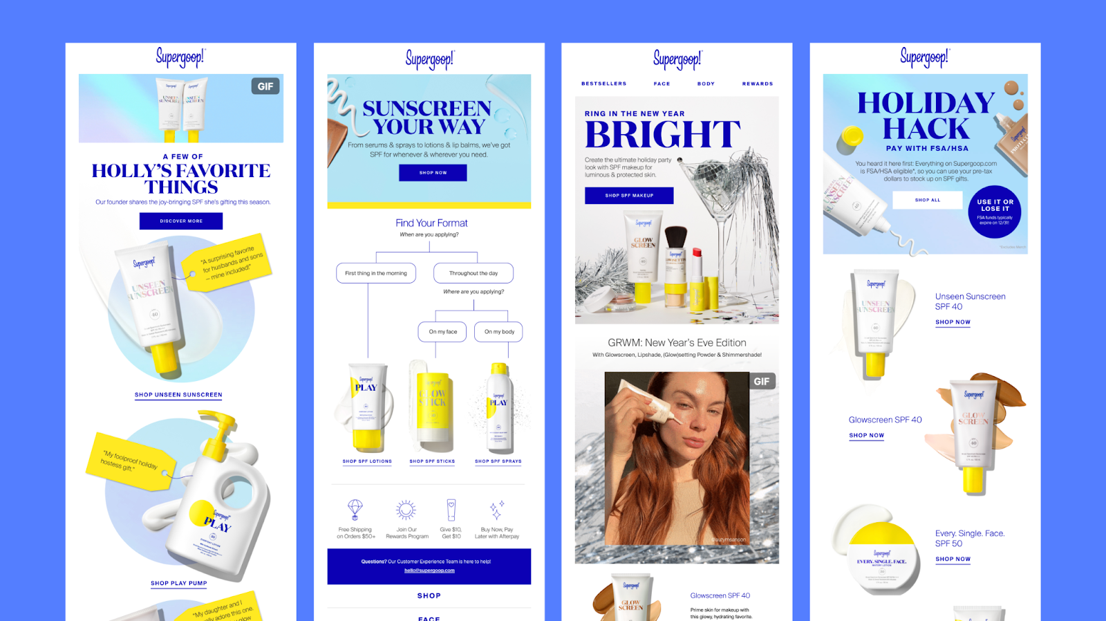
Matt Helbig: And the big reveal for this one—it's one of the most popular emails on Really Good Emails: this one from Supergoop.

Like we mentioned earlier, it’s super personalized, uses emojis in a fun way, and highlights a variety of products with 'Shop Now' CTAs sprinkled throughout. It’s a great example of how you can recommend products and guide people through the email without needing a full-blown interactive quiz.

It delivers a similar level of engagement, but with way less effort and complexity. Across the board, Supergoop does a really solid job in the beauty space—great product shots, clever use of GIFs, and strong visual flow. And in the second example here, they’re using that quiz-style graphic again, which definitely suggests it’s working for them.
And now it's back over to Logan with Seasonal.
Best Seasonal Email Award
Logan Sandrock Baird: These are our fun, offbeat categories—the awards for days that aren’t technically holidays, but maybe should be. Some brands do a great job spotlighting them in creative ways. Let’s dive in.
First up, Olipop and Finn. With Finn, Earth Day is a real holiday, but it’s not one that gets a ton of attention. They use it in a really thoughtful way to highlight their focus on sustainability. And as Kelsey pointed out earlier, it’s not just about the day—it’s about using that moment to tell a broader brand story, which we love.

Then there’s back to school—not a holiday (especially not for parents!), but definitely a seasonal moment. I wouldn’t normally connect Cherry Cola with back-to-school vibes, but they pull it off so well. Even little details like the pencils in the background of the product photo help make that connection instantly. It’s a bold move—and I love it. What do you all think?
Matt Helbig: We like to look at what people are searching for on Really Good Emails—especially the less obvious stuff. Not everyone’s focused on the big holidays, so when folks are looking for fresh email ideas outside the usual spending days, things like Earth Day really stand out. It ties nicely into some of the design trends we’ve talked about too—sustainability has become a key theme for a lot of today’s popular brands.
It’s a great moment to remind your audience of your brand’s values and impact. And then there’s back to school—not a traditional promo moment for something like soda, but they made it work. Instead of just slapping on a sale, they found a smart way to make it relevant and engaging.
Quick shoutout, too: we saw a spike in emails tied to the Olympics and Leap Year. Since those don’t roll around every year, we didn’t dig too deep into them—but when they do pop up again, they’re definitely worth thinking about as fun, timely angles for your campaigns.
Kelsey Yen: I don’t think every holiday works for every brand—and that’s totally okay. But if you can approach it creatively, have some fun with it, or use it to tell a meaningful story, then it’s definitely worth exploring. That said, don’t feel like you have to jump on a holiday just because it’s on the calendar. 'It’s back to school—let’s force a message in here' doesn’t usually land well. These brands do a great job of leaning into the moment without it feeling forced or out of place.
Matt Helbig: Agreed. And the big reveal here is Touchland’s Prime Day email. At this point, Amazon Prime Day is basically a new national holiday. We’ve seen tons of brands tapping into it—some that sell on Amazon, and even some that don’t. Brands without Amazon listings are using it as a moment to say, 'Support our small business,' while others lean into, 'Find us on Prime.'

Either way, it’s a smart move. Customers are already in a buying mindset, so it’s a great opportunity to get in front of them. It’s starting to feel like a second Black Friday—and it’s really interesting to watch how brands are making it their own.
Logan Sandrock Baird: What really intrigues me is how some brands that aren’t on Amazon are still tapping into the Prime Day hype. They’re leveraging that name recognition—but instead of pointing people to Amazon, they’re using it as a moment to encourage shopping locally or supporting small businesses. It’s a clever way to ride the wave while redirecting attention to where they want it to go.

Kelsey Yen: Building on that point—they’re actually using just their logo icon at the top, not their full brand name. So they’re really leaning into the power of Prime Day as the main draw, rather than leading with their own branding. It’s a bold move, and a smart one. They’re recognizing that it’s Prime Day that’s driving the urgency and action, and they’re positioning themselves almost as a supporting player in that moment. I thought that was a really interesting approach.
Matt Helbig: Logan, what else do you like about these emails? I forgot that this is your section!
Logan Sandrock Baird: Passion just overwhelms you, I know.
Matt Helbig: I just love email that much.
Logan Sandrock Baird: You do—you're the one who helps process all of these emails and puts them together, after all. As for this email, I love their use of color—they do such a great job theming their emails around a cohesive palette. It makes everything feel really intentional. And they’re also smart about showing real people using the product, which is super helpful—especially for something that isn’t immediately obvious at first glance, at least to my uncultured eyes. Seeing someone hold it gives you a sense of scale and how it’s actually used, which adds a lot of clarity.

Most Creative Email Award
Matt Helbig: All right, moving on to our final award of the year. The big question: What’s the most creative email you’ve seen this year? There’ve been so many different brands and styles, and creativity can be tough to define—it’s super subjective. So, I’m handing this one over to Kelsey to break it down.
Kelsey Yen: Thank you! So, the final award—Most Creative—goes to what we’re calling the Work of Art Award. And yeah, creativity is subjective, of course, but these were the emails you all voted as the most creative. We were looking for stunning visuals, innovative layouts, and designs that just felt… beautiful. Emails that really are a true work of art.
Matt Helbig: I honestly believe email is a form of art—no question.
Kelsey Yen: Our honorable mentions are Graza—a super fun olive oil brand—and Buoy.
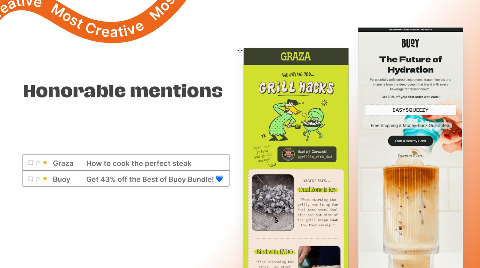
What I love about Graza is that they could have taken the safe, boring route, but instead they went bold. Their emails are eclectic, packed with personality. Hand-illustrated fonts, bright colors, creative color blocking—it all feels so intentional and unique to them. They break the traditional email layout with fun touches like arrows pointing to new sections and highlighted words that guide your eye. It’s playful, unexpected, and totally them.
And Buoy brings the same level of creativity—really bold, in-your-face graphics (which I always love). The branding hits you right away, with the CTA and offer front and center. It’s high energy, super visual, and genuinely makes me want the product. Big props to both of these brands for going all in on creativity.
Matt Helbig: We'll keep moving to the big reveal of the most creative email brand in 2024. It is...
Kelsey Yen: Armra! I love it. Just a beautiful, creative email all around—mouth-watering imagery, fun colors, great font choices. It’s incredibly visually appealing.

It honestly feels more like a piece of art than a typical email—almost like an illustration or even a page from a magazine. Just really well executed. And Matt, you pointed out a great detail—the subtle texture on the button. Such a small touch, but it adds to the whole handcrafted feel.
Matt Helbig: Yeah, totally—I love it. You don’t see a lot of gradient buttons out there, but they really nailed it here. The CTA ties in so well with the product—it’s not just a button, it’s part of the experience. And as you read through the email, you see that you’re getting something free, which is a clever way to connect the product with the action.

They use gradients and even a bit of glow in the CTA, which adds this fun, dynamic energy. It’s clear they’re thinking creatively about how to stand out in the inbox. And yeah, even though the whole email is image-based, they do a great job breaking things up visually. It feels like there are multiple entry points—lots of ways to engage throughout. That’s why, for me, they’re one of the most creative brands out there.
Kelsey Yen: I love how they break the traditional blocking of emails too. It's not regimented—it's very artistic, which is very nice to see and very different.

Wrap up
Matt Helbig: Well, that’s a wrap! Huge congrats to all the winners. We think this lineup is such a great reflection of the creativity and variety of brands featured on Really Good Emails. And most importantly—thank you. We wouldn’t be here without the incredible emails you submit and create.
Seriously, thanks for making email something worth celebrating. Let’s be honest—there’s a lot of not-so-great email out there, so it’s a real joy to highlight the work that does stand out. We’re so grateful for your creativity, your effort, and for making email a space where great design and storytelling can thrive.
Logan Sandrock Baird: Absolutely. To reiterate for folks who might have joined a little bit late, all of these emails were selected by you all—by saving them, submitting them, and clicking on them on Really Good Emails.
These were chosen from the most popular emails selected by you. Without you all, we couldn't have done this.

Matt Helbig: So now it's up to you. Submit your favorite designs to Really Good Emails. If you're curious about how you can end up in these awards and inspire a bunch of email marketers, either submit your own emails or emails that you just find really cool and interesting in your inbox. Send them over to us.
We'd love to take a look at them and hopefully add them to the site.
Logan Sandrock Baird: And of course, if you’re feeling inspired and want to create some standout emails of your own, Beefree is the place for you to start.
Matt Helbig: And for everyone who’s curious—yes, everything we’ve shared today (and more!) is available in a full report you can download. It’s packed with all the insights, trends, and extra notes we didn’t get to cover here.
Definitely give it a read—and hey, feel free to share it with your friends, your team, maybe even your family this holiday season. It’s a super comprehensive report that I’m really proud of, so go check it out!
Logan Sandrock Baird: One last thing...
Kelsey Yen: Wait...
Logan Sandrock Baird: "There's more, gentles! Yes, I'm so terrifically excited to announce our Unspam 2025 event, which we're hosting at a brand-new location.
We're going to Baltimore, Maryland, on April 23rd and 24th of 2025 at the Lord Baltimore Hotel. Early bird tickets are on sale now, as of today. You all are the first to find out.
Go check us out, get some tickets, and book some rooms at the Lord Baltimore. We'll have more details to share. We wanted to make sure to get this out before the end of the year.
We know people have budgets to spend sometimes, and we've had a lot of people really anxious and excited about wanting to plan their 2025 and make us a part of it, which is heartwarming. We really appreciate that as well."
Matt Helbig: "Yes. And I heard those early bird tickets are limited, so you'll get some savings. Definitely be one of the first ones to sign up for Unspam 2025. I'm excited. I've never been to Baltimore. There are a lot of new faces with the Beefree team joining, so it's really fun. I think it will be a fun time. Good part."
Logan Sandrock Baird: "I mean, I remember attending the first Unspam in, I think, 2018, and really falling in love with it as an event. Now, getting to be on the inside and planning it with you all is such a joy. We're really excited about what we're planning for you all."
Some really good questions
Matt Helbig: All right, that's all we've got for today. We can talk through some of the Q&A questions. We're happy to answer anything here. I will pull up the top-voted questions.
'How does everyone feel about image-based email versus raw text and HTML?'
Logan Sandrock Baird: For a bunch of reasons—accessibility being the biggest—you really don’t want to go fully image-based. Ideally, emails should include a mix of images and live HTML text so screen readers can actually read the content.
It also helps with performance—emails load faster, which is key. If you’ve got a giant image that’s slow to appear, you’ll probably lose someone’s attention before they even see your message. I know I’ll bounce if something doesn’t load quickly—I just get bored. Kelsey, what do you think?
Kelsey Yen: I think it really depends on the context. For something like a product launch—where the visuals are key and hard to replicate with live text—it can make sense to lean on images more. But it’s definitely not ideal to do that all the time.
For both accessibility and deliverability, keeping live text in your emails is really important. You just don’t want to rely on images alone for your message to land.
Matt Helbig: Live text and HTML are definitely the way to go. Like you mentioned, Kelsey, there are times when you’re working under tight deadlines or want to use a brand font that just doesn’t render well with live text—those are the moments when an image-based email might make sense.
But even then, you’ve got to be mindful. At Really Good Emails, we always check how emails look on mobile—are the CTAs actually tappable? Are they big enough to interact with? If you’re going to rely on images due to limitations, just make sure you’re thinking through those details. But whenever possible, stick with live text—it’s better for accessibility, performance, and overall usability.
Do you have any best practices when it comes to creating GIFs for email?
Logan Sandrock Baird: The goal with GIFs is to use the fewest frames possible to convey the movement. You want to keep the file size light so it loads quickly. And definitely make sure you’ve got a good fallback in place for email clients like Outlook that don’t support animated GIFs.
The truth is, it doesn’t take a lot of frames to grab attention—it’s the movement itself that catches the eye. There are plenty of solid online GIF makers out there, and I think Canva even has a pretty good one. That’s usually my go-to advice.
Matt Helbig: Totally agree. Like you said, Logan, you can do a lot with just a few frames. No need for a 40-minute movie embedded in your email—no one’s sticking around that long.
You’re trying to catch attention in the first couple seconds, so keep it tight. And super important—don’t hide key info in the last frame of your GIF. Don’t make your CTA or your main message something people have to wait for. Front-load that content so it lands immediately. Small file sizes, simple motion, and a clear purpose—that’s the sweet spot.
Do we have any metrics for how these emails performed?
Matt Helbig: We do not. That’s the honest answer. We’d love to know, but brands don’t always share performance data. And honestly, even if they did, it’d be a ton of data to sift through for all these different emails.
Logan Sandrock Baird: Excellent clarification—and also very funny that you picked a question only you could answer... and the answer is that we can’t answer it.
Can we look into fundraising?
Matt Helbig: es, we can—and we will! But with fundraising as a category, the challenge is that we need more examples to feature. So if you’ve got great fundraising emails, definitely submit them. It’s just tough for us to include what we don’t receive.
Logan Sandrock Baird: Just a reminder—Really Good Emails is community-driven. The categories and content you see on the site exist because you submitted them. So if there’s something you’d like to see more of—like fundraising—send those our way. We want to see them. Matt devours email like a hungry Pac-Man in his inbox.
Matt Helbig: Exactly. And if you’re hesitant to submit an email to Really Good Emails—just send it. The worst thing we’ll say is no.
What are your opinions on fonts in emails? Our managers told us we need to use Arial since it's a global font—but it’s so ugly. Do you have any thoughts or suggestions? Also… have you heard of Comic Sans?
Logan Sandrock Baird: You can absolutely use web fonts in email—you just need to have fallbacks. That’s where font stacks come in. In the CSS, you define a list of fonts so that if the first one isn’t supported, the email client moves down the stack to the next one. Eventually, yes, you’ll probably hit Arial, especially for sans-serif options.
For clients that support web fonts, that’s great—you can get creative. When people talk about ‘global fonts,’ they’re usually referring to system fonts—ones that are pre-installed on most devices. Web fonts, on the other hand, depend on support from specific email clients.
If you’ve got a special brand font that isn’t widely supported, one option is to include it as part of an image—for example, using it in a headline graphic—then support it with live text for accessibility and performance. That’s my take. Kelsey, any thoughts?
Kelsey Yen: I think you nailed it. But just to add—Arial isn’t the only global font. If you’re going that route, there are definitely more visually appealing options. You can even mix a serif and a sans-serif for contrast and a bit of visual interest. Even with limitations, there’s room to get creative—so don’t feel stuck.
Matt Helbig: Definitely try to include web fonts where you can. If they’re not supported, sure—fall back to Arial or whatever’s next in your stack. But also take a look at your audience. If a large chunk is using WebKit-based clients, like iOS, you’ll probably get good mileage out of web fonts.
Logan Sandrock Baird: That's an excellent point. Absolutely.
Any guidelines or best practices for email footers? Any resources or opinions?
Kelsey Yen: Yeah! First, there’s the essential footer info you have to include—like your unsubscribe link, copyright notice, and legal disclaimers. That’s non-negotiable. But beyond that, think about your audience and segmentation.
You don’t have to use the same footer in every single email. Tailor it to who you’re targeting—maybe prospects, new customers, or highly engaged users—so you can surface the content or links that make the most sense for that group.Just be thoughtful—you don’t always have to use the exact same footer for every send.
Matt Helbig: I think people try to cram a lot into the footer—social links, multiple CTAs. And obviously, the unsubscribe link has to be there. But there’s a lot you can do creatively in a footer.
Look at what people click on your website and try pulling some of those high-interest links into your footer. Then keep an eye on performance—if no one’s clicking something, maybe it doesn’t need to be there. Don’t treat the footer like it’s locked in forever. There’s room to A/B test and improve it.
Logan Sandrock Baird: And remember, the people who are reaching the footer are scrolling all the way to the bottom of your email—that’s a good sign. We love those folks. But with email, it’s always a balance of giving people just enough choice. Too many options in the footer can add friction.
Over time, I’ve really shifted my thinking on this—now I’m more focused on keeping footers clean and purposeful, while still including the elements that matter to your brand.
Kelsey Yen: And don’t forget to update it regularly. Nothing worse than a broken link in the footer.
What do you suggest for intervals of time between emails for massive mailing programs?
Kelsey Yen: Massive mailing programs—how massive are we talking? Like, hundreds of thousands of people?
Matt Helbig: 10, 20 million.
Kelsey Yen: 20 million—the entire universe! When you’re mailing to a really large audience, I think the first thing to consider is your strategy. Like, does everyone really need this message?
If there are segments in your audience that are consistently unengaged—people who aren’t opening or clicking—it’s probably a good idea to suppress them. Keeping them out of major sends can really help your deliverability.
So when we talk about timing or intervals, I’m assuming the concern is deliverability. Step one is just being thoughtful about your audience—do they all need to receive this? Can we segment out unengaged or inactive users?
Step two: think about how you send. A lot of ESPs (email service providers) have a send-over-time feature, where you don’t blast everyone all at once. If it’s not a time-sensitive message, like an event reminder, you could even batch it out over a few days.
For newsletters or evergreen content, there’s nothing wrong with sending in waves. And honestly, if your IP is already known for sending to that size audience and you’ve been consistent with your sending behavior, you’re probably fine. But again, being thoughtful and testing is key.
Matt Helbig: Yeah, I’ve worked on email programs where we had suppressions in place so that no one would get more than one message per day—and that’s something worth considering.
But like you said, Kelsey, it really comes down to engagement. Send as many emails as your audience is willing to engage with. Some brands find their sweet spot is three emails a week, others send daily—it all depends. There’s no one-size-fits-all answer here.
Is there a free-to-use program to test an email’s accessibility score—color contrast, text, etc.?
Logan Sandrock Baird: I can’t speak to a specific free tool off the top of my head, but there are a few great platforms out there—InboxMonster, Litmus, Sinch (formerly Email on Acid), and Parcel all let you test email accessibility. Some of them offer free trials or limited access plans, which can be helpful.
There are also solid web-based tools that check color contrast, accessibility, and legibility. They’re usually designed for the web, but the principles still apply to email. I typically use a combination of those depending on what I’m checking.
Matt Helbig: I think there’s even an opportunity to use something like ChatGPT to get feedback on your email—ask it for accessibility suggestions or guidance on how to improve your layout, contrast, or language.
But yeah, for me it’s always a combo of tools. And honestly, one of the best things you can do is test the email on real devices and clients you’re targeting. That’ll tell you a lot.
What criteria do you use to determine whether an email gets featured on Really Good Emails?
Matt Helbig: We do have a checklist of things we’re looking for, but I think the biggest hurdle we see is emails trying to do too much. When an email gets bloated—too long, no clear direction, not solving a problem—it loses focus and impact.
Pixels are free, sure. You can add as many as you want. But when it feels like a never-ending scroll with no purpose or clarity, it’s just not that compelling to us.
What we are looking for is a solid mix of personalization, good design, strong copywriting, a healthy balance between live text and imagery—and most importantly, an email that solves a problem or meets a need for the customer.
I’ve always heard that image-heavy emails go straight to the spam folder. Is that still true, or is that a myth?
Logan Sandrock Baird: I’ve got an answer for that—not to step on your question! So, once upon a time, yeah, that was true. Image-heavy emails used to trigger spam filters pretty easily.
But spam filters are constantly evolving. These days, it's much more about your sender reputation. If you're sending from a consistent 'from' name, if recipients recognize you, if they open your emails, mark you as a contact—that’s what keeps you out of the spam folder.
So, in today’s landscape, it’s a myth. Relevance, consistency, and trust are what matter most.
How does quiz-style emails work on mobile, especially if they’re image-only?
Matt Helbig: For me, it’s all about designing a separate mobile view. These types of emails don’t usually require a lot of tapping—they’re more about scrolling and engaging visually. You can create a fun, scrollable, typographic layout for mobile that still captures the quiz feel. So that’s my take.
Logan Sandrock Baird: Totally agree. You can also create a secondary, mobile-optimized image or layout that’s simpler and easier to read. Or, if your main version tests well and stays legible even when scaled down, that works too. Just depends on how it performs in testing.
What’s your ESP of choice?
Matt Helbig: I feel like it’s so dependent on your brand—the kind of data you have, how many contacts you're emailing, what your goals are. It really varies based on a lot of different factors.
Logan Sandrock Baird: Yeah, the classic email answer we love and also kind of hate is: it depends. It really just depends on your brand’s needs.
One tip I’d suggest is looking at what ESP your competitors are using. You can usually find that info at the bottom of their emails. That can give you a clue as to what platforms are working well in your specific vertical.
Matt Helbig: We actually ran a survey on ESP satisfaction—how happy people are with the platform they’re using. Some ESPs definitely get more love than others.
Kelsey Yen: And fun fact, the ESP is the most commonly replaced tool in the email tech stack every year. So do your research, try out demos, and test platforms. Don’t just take anyone’s word for it.
What are some best practices for preheader preview text? I know the Apple update recently changed how that displays.
Kelsey Yen: Things are always changing, so it’s tough to stay totally consistent. But personally, I like to have a little fun with preheader and preview text—it’s a great spot to tease what’s inside the email.
Keep it short, though—too many characters and it won’t show up in the inbox preview. I’ve also been seeing more emojis in preheaders, which can help catch the eye since a lot of preview text tends to be plain. If you're not using emojis in your subject line, the preheader is a great place to play around a bit. It’s definitely a spot where you can get creative.
Matt Helbig: I think it should support the subject line whenever possible. It can preview content, sure, but I like when preheaders add a little extra value—not just repeat what’s already in the subject line.
Also, since you're clearly the funniest person here, Logan—what’s your take on using humor in email, especially for brands with a more professional tone?
Logan Sandrock Baird: Look, 'very professional humor' is just dry humor, honestly. If your brand voice is buttoned-up, but you still want to add a little wink, there’s a way to do that without going off-brand.
Someone who talks about this incredibly well is Lianna Patch—her agency, Punchline Copy, has some great resources and courses on using humor in email, no matter your brand voice. I really recommend checking her out.
You can still use humor—even in professional settings—as long as it’s not tied to anything too sensitive. Like, if you’re a pharmacy sending refill reminders, probably not the best place for jokes. But if you’re in a B2B space and want to poke fun at something we all deal with—like Outlook, for example—that kind of inside joke can land well without feeling unprofessional. Just keep it dry and smart.
Matt Helbig: Great advice. And there’s also a fantastic Unspam talk from Lianna Patch on this topic—definitely worth watching.
All right, I think that’s it from us today. Thanks so much for joining! We hope we answered your questions thoroughly. And don’t forget—Unspam is coming up, so grab those tickets early, soon, and often.
Thanks again for submitting your emails and doing the work. We seriously couldn’t do this without you.