


Email marketing deep dive with Megan Boshuyzen
Matt Helbig and Mailgun’s Megan Boshuyzen unpack Email Camp, showing how accessibility, live text, and smart CTAs turn event emails into signups.
September 12th, 2024
Matt Helbig and Max Sturtevant break down Surreal’s playful, minimalist email approach. Learn how clarity, clever copy, and smart design drive results.
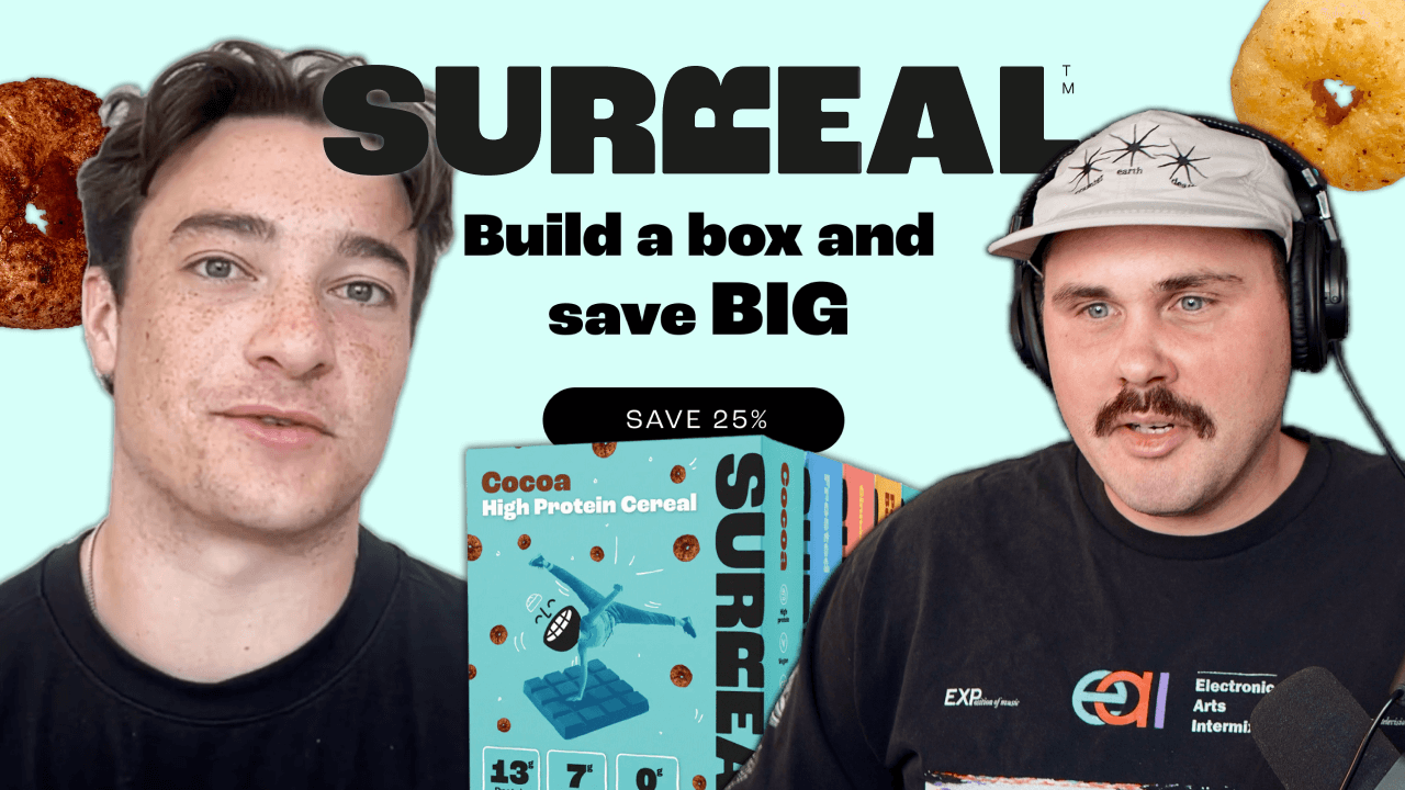
Matt Helbig and Max Sturtevant dive into Surreal’s cheeky email strategy—spotlighting its irreverent voice, sleek design, and one-message focus. They unpack how simplicity, humor, and smart structure help this cereal brand stand out—and convert—in a crowded inbox.
What makes someone stop scrolling and actually read your email? For Surreal, it’s not just fun copy or bold colors—it’s the perfect blend of simplicity, confidence, and clarity.
Surreal, the UK-based cereal brand with a flair for sass and no-sugar claims, has been gaining buzz on Really Good Emails. But do their playful, minimalist emails just entertain—or do they actually drive results?
In this Feedback Friday session, email experts Matt Helbig and Max Sturtevant break down what Surreal does well (and where they could push further)—from teaser campaigns and social proof to abandoned cart flows and footer strategies.
Join Matt and Max as they unpack Surreal’s standout email approach—and share practical, conversion-focused insights any ecomm brand can use.
Matt Helbig: What's up, Email Geeks? Welcome back to another episode of Feedback Friday. This week, we're taking a look at the email strategy of Surreal, a UK-based brand that's making waves on Really Good Emails. We've got Max Sturtevant from Wellcopy with us—an e-commerce email marketing expert who’s generated over $40 million in revenue for top brands.
He’ll be sharing insights on some unique Surreal emails—from teaser campaigns to referral strategies and everything in between. So whether you’re a seasoned pro or just getting started with email marketing, stick around. You’re going to pick up some actionable tips to boost your own campaigns.
Let’s jump in.
Alright, we picked a few different emails from Surreal. It’s been trending on Really Good Emails. It’s a UK brand, kind of a Magic Spoon competitor. They’re doing some interesting things with different types of emails, and I thought it’d be up your alley to talk about with your e-commerce background.
Max Sturtevant: Let’s do it.
Matt Helbig: So this first one, I’d consider a product launch email—a teaser, really. They’re saying “guess our new flavor,” with some interesting CTA copy like “What could it be?”—trying to entice the audience, then leading them down. Not a ton going on in this email, to be honest, but have you seen these teaser campaigns work well for your clients? Or do you go straight into a launch?
Max Sturtevant: Oh, absolutely. This kind of thing works well. I like to use email as an educational mechanism. I don’t think of it purely as a conversion tool. It’s part of the funnel and the customer experience. I don’t track revenue too heavily from email—some people overcredit it. I think about it from a customer experience perspective. If I’m a customer, is this fun and enjoyable?
Of course, you need to look at the numbers. Click rate is a big one I focus on. But from a customer experience angle, this kind of email is super fun. That’s the biggest thing for me. A couple of lines of copy, two centered CTAs—they look the same, nothing fancy. Super simple email, with a little pizzazz at the bottom from the gif. But a hundred percent, we see these emails perform well in terms of getting a launch to outperform not having something like this. So, like, “Oh my goodness, Surreal is having this new flavor”—nobody's doing that.
But sending something like this, that’s ideally what you want to happen—but even if it doesn’t, it still plants a seed in someone’s mind. Like, in the back of their head, they have that. And so you occupy a little bit more mental real estate when you do something like this.
And so, when the customer sees that email notification with a subject line that says “Just dropped,” they’re a little bit more likely to click open and be like, “Oh yeah, people are talking about this”—because they saw this sort of email come out.
If someone sends an email just to hype something up—not to sell—it tells the reader this is legit. That’s why it performs well.
Something I do that ensures solid revenue from every email is adding “Shop Now” and “Shop by Category” buttons in the footer. This one doesn’t have anything in the footer except social links. But the footer buttons work. Maybe someone doesn’t care about cereal but remembers they need yogurt or something else. If you have buttons in the footer, you always pick up clicks.
Looking at Klaviyo and other platforms, even with different click tracking setups, about half of our clicks come from footer buttons—especially when we use a 2x2 stack: shop by category. It’s a huge, low-hanging fruit to boost click rates.
Matt Helbig: That’s a great recommendation. I’m a big fan of the footer, too. I sometimes worry it distracts from the main message or CTA, but having some useful links down there gives people a next step if they’re not into the main message.
Max Sturtevant: Totally. I’m not a fan of nav buttons in the header. They never convert well and only distract people.
Matt Helbig: Ok, let’s move on. They’ve got a really fun tone—playful, bold colors and text. They’re leaning into nostalgia while keeping it light. It’s just cereal; not that serious. This next one is more of a product highlight email. What caught my eye is how they use customer testimonials as social proof. I’ve seen you post about how effective those can be.
Max Sturtevant: Oh yeah, 100%. People know what’s going on in their inbox. If you send an entire email about reviews, it tells them you're legit—especially when you include stars. That subconsciously builds trust. You don’t need long reviews. Sometimes just a strong headline and three short testimonials is enough. People barely skim emails. They’ll read the first line of each testimonial. Just having them there matters more than what they say.
We’ve also seen single-testimonial emails work really well. Like: “Carol loved this. You might too. Shop now.” That kind of passionate, focused message performs.
I love how simple this one is. They’re not overloading it with product benefits, social links, or referral programs. It’s just: “Hey, people like this. You might too.” That’s probably why it got so many clicks.
Matt Helbig: I always say: you get one click. Your main CTA is what most people will click on, so keep it focused.
Max Sturtevant: Exactly. Get your customer to do one thing per email. That’s all you want them to do. You want one message to be picked up per email, and then you want one action to be taken. That’s why, typically, I don’t like to show so many benefits of my product at once. I just like to choose one per email. You’re lucky if someone looks at your email for three seconds, so you’ve got to get the message across fast. A simple email that communicates in two or three seconds puts you in a great spot.
Matt Helbig: At Unspam, someone said 4.5 to 4.8 is a weirdly good review number—feels more legit.
Max Sturtevant: Totally. In our testimonial emails, I always include the cumulative review score—like 4.7 out of 5 based on 13,146 reviews. You can’t fake that. People ignore platitudes like “best in the world,” but they trust facts. One strong fact or stat can transform your email’s performance.
Matt Helbig: Cool. We’ll keep on moving. An interesting trend is building a bundle to save more money. Have you done any sort of bundling within your products or anything you're trying to sell?
Max Sturtevant: One of the things that I notice is, if you run the same offer—say for sales, you always run 20% off—you’re gonna get a lot of fatigue from the list that way, and it’s gonna go down in performance. So you need to get creative with your offers now and again to make sure you’re bringing some novelty—because people like new more than anything.
That’s also why you need to be sending new types of emails, new angles, new designs, and always mixing things up. Because if somebody knows that every single email is going to be the same templated thing, they’re not going to keep opening it—because it’s not new.
And it’s the same thing with offers. Bundle offers help. For example: “Save yourself a trip to the digital aisle—buy two months of cereal now and save.” Or: “You’ll be back for more boxes anyway, might as well get them now and save a few clicks.”
This email does a great job. Super simple: “Save up to 25%, mix and match, seven flavors.” No paragraphs of copy. It’s not a Black Friday-level push—it’s just mixing things up and giving bulk buyers an easy option.
Matt Helbig: Yeah, totally. I feel like if you even outline this email—if it was just plain text—it still works. It feels like a little introduction, then some bullet points, and a clear call to action. So even in that way, I like how it’s set up. Yeah, I think it’s very clear, very easy to skim and read—like you were saying with the one column—it brings you right down to a CTA.
Max Sturtevant: This, to me, is a near-perfect email for what it’s trying to do. This is near perfect. I love a simple headline that’s branded with a cool graphic, a nice button right at the top so the customer doesn’t have to scroll, and some quick, short, snappy copy right below it. Then, a quick graphic of some main points. They don’t have to deal with distracting graphics. You don’t have to squint your eyes to try to click. You don’t have to work to find a button to click.Everything is laid out for you. Super clean, super easy.
Somebody who's in line at McDonald's, quickly checking their inbox—they're only glancing at emails for two seconds. But they still have a chance to understand your message and click. Super easy. This, for me, as far as layout and the job it’s trying to do, is like a near-perfect email. I’d still like to see footer buttons. If someone doesn’t care about bundles but wants one product, there’s no way to act on that here.
Right now, that person doesn’t have an option to shop when they get to the bottom of this email. And that’s the kind of thing where I’m sure they’d get a couple more sales—like, “Oh, this was a cool email,” and “Oh, I am in the mood for cereal, but I don’t want to buy a bundle.” It’s too much work for them to click a button and then navigate your site to find a single option. No. They should have those options right in the footer so people like that can still click through to the site and they’re not cut off.
Matt Helbig: Another angle—especially around Black Friday—is for brands that don’t like to discount. Bundling gives them a way to add value without slashing prices across the board.
Max Sturtevant: Exactly. One brand I work with doesn’t do discounts. For Black Friday, they release new products each day for five days—limited time only. It’s still a huge event, but not “BOGO” or “20% off everything.” It’s fresh and exciting. If you’re not a discount brand, that’s the move.
Matt Helbig: Out of ideas for your upcoming holiday campaigns?
Beefree’s got your back. Cut through the BFCM noise with strategies that stand out—from early bird offers to last-minute deals. We’ve got templates that boost open rates and keep your customers coming back—whether it’s mobile, desktop, or that one ancient device in the corner. BeeFree’s templates are ready for action.
Leverage customer data to make every email feel personal, with interactive elements that make people want to click—and watch those abandoned carts come back to life. Ready to make some BFCM magic happen? Visit beefree.io or click the link in the description to get your secret weapon for Black Friday and Cyber Monday success.
So they also do subscriptions, which I guess a lot of brands do. I feel like there are tons of coffee subscriptions, things like that. But yeah, just a different type of email. I haven’t done as much with subscription-type emails, so I wonder if you have any tips on any of the stuff that you’ve done.
Max Sturtevant: Nobody cares about anything besides saving money. Like, the total control, early bird specials—nice little adds, but nobody cares. They really care about the savings. That’s the only reason someone’s going to subscribe. More often than not, if you’re sending an email with a subject line like “If you subscribe, you save this much,” that’s what gets people.
If there were a way to track what actually got a person to subscribe from this email, I’d say 99% of them subscribed because of the discount. I’m not saying you shouldn’t include the other benefits—you should—but I wouldn’t try to overthink subscription emails. Because in our experience, if we send a simple email that’s like, “Just a reminder: if you subscribe, you get to save an extra X percent,” that’s usually enough to push someone over the edge.
Maybe just hint at, “Hey, why keep reordering when you can just get it sent to you automatically?”. Or—something that works especially well for gift giving—is gifting someone a subscription. A lot of times we’ll lean into that more during the holiday season. You’re not just buying someone a single box of cereal—that’d be a pretty bad Christmas present—but you could say, “Hey, I got your breakfast covered for the next 12 months. I got you this subscription.” That’s something we see work well. Another angle is for people with a special event in their life—like, if someone’s got a birthday coming up, gift them three months of free meals, or whatever.
For some of our brands that are more in the luxury food space, we’ll say, “Subscribe someone for three months of meals so they don’t have to worry about it. They’ll get a new meal every week,” yada yada yada. So that’s an angle we see work—but mainly, it’s price. I always like new angles—newness, 100%. This is the kind of stuff you should be sending. The more variability you have in the types of emails you’re sending, the better—because it keeps people subscribed.
Matt Helbig: Alright, well, we’ll keep moving. This one kind of popped out to me. It’s an interesting combination. I guess it’s a little bit different than a normal browse abandonment or abandoned cart. They do bring in a product, but I thought an interesting thing—something I’ve been seeing a lot more—is this “us versus them” comparison chart right in an abandoned cart email.
I haven’t really seen that before. I’ve only seen that more in a product-focused email or in a welcome series. So do you feel like this abandonment cart gets the job done? Or would you improve it in some way?
Max Sturtevant: Couple things that stand out to me. I'd like to see where in the abandonment flow this email was sent. One thing I don't like—I've always seen the most success when you put the specific item the person abandoned right at the top of the email, above the fold. Because that’s what’ll catch somebody’s eye. Right now, when I’m looking at the top section here, I can’t even tell that it’s an abandoned email that’s custom to me.
This person just left this product behind—and we can grab their attention. So typically, I just have a thin slice at the top that’s like: “Hey, did you forget something?” Or you could include some social proof if you want.
But then just put it right in their face—“You left this behind.” That grabs their attention. They’re like, “This email was custom for me.” So that’s the one thing that sticks out to me about this email. I like what they’re saying—I think it’s good—but I think it’s burying the abandoned item in that “us vs. them” block.
Now, I think that part is great. I used to have mixed feelings about it, because it can seem like you’re gloating. But now I think it’s just a more differentiated way to list out your benefits. So rather than having a block of copy that says, “We have no sugar, this many carbs, this much protein,” you’re actually making it super easy for someone to look at. It’s essentially a bullet-point list—but with a little extra compare-and-contrast style so someone can really see the differences and take it home. So I think it’s great. I’m definitely a fan of putting that in your abandonment emails.
I’d say that’s probably something you could have in its own abandonment email—one that’s nothing but the abandoned item and then that section. I feel like there’s just a little too much going on here—there’s the top section, then the abandon section, then the “us vs. them” section. The content is great—I’d just split it up differently and make it more conversion-oriented.
Anytime I have an abandonment block—like the one we see in the middle—I always have a button right next to the abandoned item. That way, they don’t have to scroll back up to shop or scroll down. Just have it right there.
Matt Helbig: Yeah, I was expecting like a “Buy Now,” “Shop,” or “Checkout” type button here.
Max Sturtevant: Nowhere in the email does it say, “This is your item that you left behind,” or “Hey, you viewed this item.” I consistently see that when you address it directly—like, “This was yours”—it converts better.
Matt Helbig: Yeah, to your point, it almost feels like a promotional email up top—and then, oh, okay, this is an item that I may have looked at or added to my cart. So to your point, it’s not super clear about the intention.
Max Sturtevant: And who knows—maybe it works well for them. I just haven’t seen it work well for me.
Matt Helbig: With your abandonment carts, do you do any sort of other products—like recommended or bestsellers—in a flow like that?
Max Sturtevant: I’ll only do that later in the flow. For the beginning of the flow, I want to make it as simple for the customer as possible. It's just like, “Hey, you left this item. Continue shopping.”
For browse abandonment earlier in the flow, I will show them other products—because it’s like, you viewed this item, but maybe you didn’t like it. You might like these ones. But if somebody added to cart, they probably liked that item. It’s just a timing thing—they’re not there yet. So they just need those reminders. And I don’t really want to distract them or overwhelm them with options. It’s like—no.
You already picked a good option. You picked a good one. Just go forward with it.
Rather than give them the option to be like, “Oh, I don’t know... should I have gone with that? Or this one?” Because I sometimes have that issue. If I’m in a clothing store, I find a shirt I like, and I’m on my way out—and then I see a couple more, and I’m like, “Do I really want this one?” And then I start doubting if I even want a shirt at all. Whereas if I had just picked the shirt from upstairs and thought, “This is awesome,” and had tunnel vision—I would’ve walked straight to checkout.
But once I start thinking, “Oh, I could’ve gotten this one, or that one,” now I’m like, “Ah, maybe I should just save my money,”. So that’s typically my strategy. Around email four, maybe I’ll start introducing some other products—maybe do some custom recommendations as well. But not until later in the flow.
Matt Helbig: I think I’ve seen some brands—if I signed up with a welcome offer and I still haven’t used my discount—they’ll try to pull that into an abandoned cart flow. Just something like, “Hey, you still have this discount to use on the product you added to your cart.”
Max Sturtevant: For sure. And something I always like to do—especially for at least that first email in the abandoned cart or abandoned checkout flow—is split the recipients based on their cart value. If they qualify for free shipping, just tell them: “Hey, you qualify for free shipping.”
Just add a small line of copy in the header section of that first email—something like, “You can finish your order today with free shipping.” That usually converts a lot better.
Matt Helbig: Okay, this last one here is a referral email. What do you think about referral programs? What do you think about this email? Is there anything that stands out to you?
Max Sturtevant: First of all, again, I love how simple it is. They’re not trying to do too much. It’s just a headline and button at the top, then some body copy and another button. I love how simple it is. I hate crazy long emails with way too much copy that no one’s going to read. This is great. The only thing is—at the top—I’d probably put a line about the benefit you’re giving your friend.
For me, I’m more likely to refer someone when the focus is on them. Some of the data I’ve seen is mixed, but overall, it performs a little better if you focus on, “Do you want to be a nice person? Give your friend 15% off,” rather than, “Do us a favor. Help us make more sales.”
Instead of framing it as, “Hook us up with your friends,” like, “Do this for our big company that makes millions of dollars every year,” it’s better to say: “Hey, you love your friends, right?” Or, “Is your friend having a rough day?” Or, “Want to give your friend a pick-me-up? Give them $10 off their order.” That angle performs better.
People know what you’re doing. They know you’re making a ton of money. So just asking them for more money can feel a little off-putting. Focusing more on the benefit for their friend works better. Yes, they’ll also get credit—but typically, emphasizing the friend is what drives more action. So instead of “You get $10 off,” say, “Give your friend 15% off—they’re your friend. They deserve it.” We don’t see crazy numbers with referral programs, but it’s a nice little bump. It’s just good to have as an option for people.
I don’t send too many standalone referral emails, but I always include a slice about referrals in the footer of every email. I’m a big fan of footers—just putting useful info there. I’ll usually add some social proof logos, shop-by-category buttons, social media links, and a referral program bar if the brand has one. Just a simple line like: “Give your friend 15% off and get $10 off by sharing,” and a “Learn More” button. That’ll consistently drive traffic. Every single email you send is a chance for someone to see it and share it.
Matt Helbig: I definitely agree. Footers are, I think, an underappreciated piece. They get overlooked a lot. They just have the social icons. But I think you’re right—there’s a lot of value in thinking about that section, trying to make it a little more user-friendly and helpful for the customer.
Alright, well I think that’s mostly it for Surreal. Are there any other types of emails that you think would work well for this brand?
Max Sturtevant: For them specifically? I think just a little bit more on the ingredients in the emails.I think people really do care—especially today—about what they’re eating and what they’re putting inside their body. That’s one thing we didn’t see. We saw the “us vs. them” section, and I think that right there could be turned into a full email. But just really repeating that over and over again.
I’m a big believer that you can’t repeat yourself too many times when it comes to branding and your unique selling propositions.
People forget. There are thousands of brands out there—they’ll forget your message. So just keep telling them.
Usually, with this sort of section, I’d just repurpose it and send it as a whole campaign. And have it as a recurring campaign—take that little section, change the colors, maybe change the layout, and include it in a couple of different emails a month. And in some of your flow emails, too. I think that’s something that—especially for them—would work well. I don’t know, I haven’t followed their emails too closely. They might already be doing it. But that’s the type of stuff I wouldn’t be afraid to repeat.
Matt Helbig: Awesome. Well, thanks for taking the time today. I appreciate you. People should give you a follow.
Max Sturtevant: Yeah, thank you so much—and thanks for having me. That was fun.
Categories:
Feedback FridayMatt Helbig and Mailgun’s Megan Boshuyzen unpack Email Camp, showing how accessibility, live text, and smart CTAs turn event emails into signups.

Accessibility, applied: Matt Helbig and Kelsey Yen reveal how inclusive design turns real emails into better user experiences.
Dive into the world of unmatched copywriting mastery, handpicked articles, and insider tips & tricks that elevate your writing game. Subscribe now for your weekly dose of inspiration and expertise.